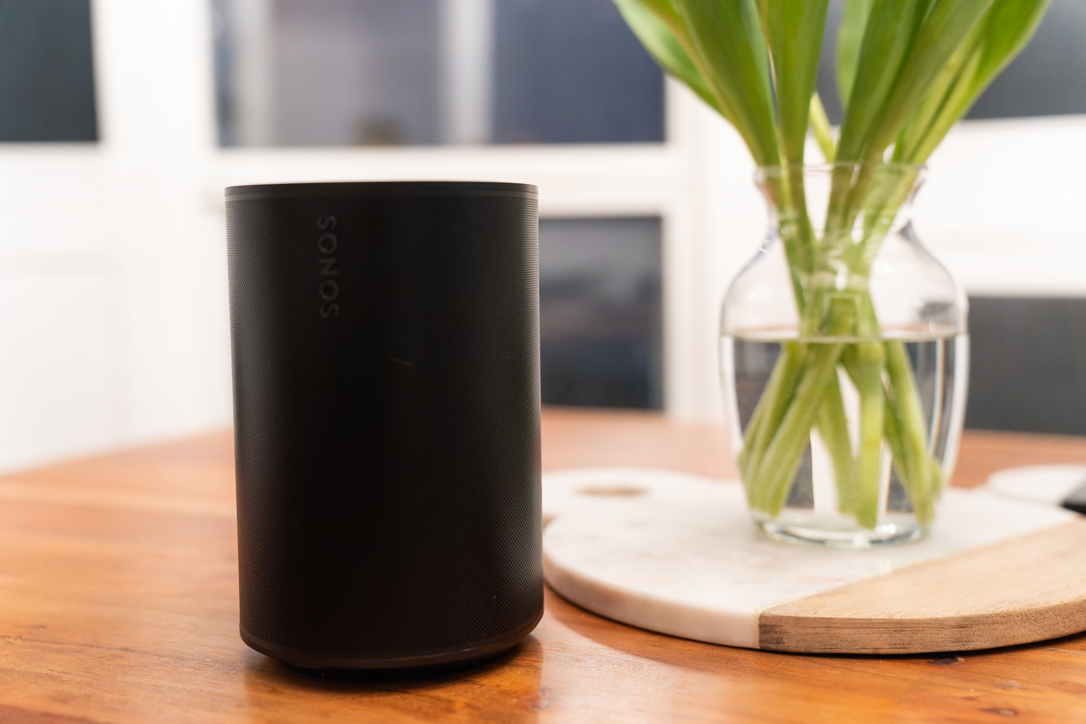
Indian startup Ultrahuman has made a name for itself since 2019 by building out a subscription fitness platform which offers a range of workout and wellness-related content, integrating with third party wearables like the Apple Watch. In 2021 it expanded into offering medical grade sensing hardware which monitors real-time blood glucose — spinning up a program focused on encouraging users to track their metabolic health as a fitness intervention. This was followed, last summer, by a teaser of more hardware incoming: A smart ring of its own design — to complement the existing CGM (continuous glucose monitoring) sensor program but which it also offers as a standalone health-tracking wearable to compete with the likes of Oura’s smart ring.
TechCrunch tried a beta version of Ultrahuman’s Ring (or R1), as its plainly called — testing it in combination with its CGM-based metabolic tracking program (M1) over a month’s use and for several weeks on its own when it did not also have access to real-time glucose data. So there are actually two review scenarios here: The Ring + CGM; and just the Ring. (We’ve previously tested Ultrahuman’s CGM-based program on its own — click here to read our report on the M1 from last year.)
For those not already familiar with CGMs, these are partially invasive sensors which are worn directly on the body — containing a filament that’s inserted under the skin to allow the hardware to sense changes in blood glucose via the wearer’s interstitial fluid.
It’s a different story with the Ultrahuman Ring: All the sensors are fully contained in the body of the smart ring and only non-invasive techniques, such as optical sensing, are used to track the user’s biomarkers. Absolutely no skin puncturing required.
However, if you’re up for wearing both the Ring and the M1, Ultrahuman’s its pitch is you’ll get a deeper level of health tracking as it’s platform is able to link more biomarkers and draw a more detailed picture of how your lifestyle impacts your metabolic health.
While tracking blood glucose is most commonly associated with people who have diabetes or prediabetes, in recent years a wave of startups has been commericializing CGM technology for a more general health-tracking and/or fitness purpose — creating a new category of “biowearables”. The focus here is on trying to improve understanding of how lifestyle factors like diet, sleep and exercise impact longer term health outcomes. And since metabolic responses to different foods and activities vary from person-to-person the promise for this type of tracking is about giving the user a tool to see how their own metabolism copes with whatever they’re throwing at it — to help them go beyond generalist health advice protocols and really live their best (healthiest) life.
Overview
As a standalone wearable, Ultrahuman’s claim for the Ring is it provides “deep” metabolic insights — drawing on data from the embedded temperature sensor, PPG sensor and motion sensing IMU plus its own algorithmic processing to track three factors which can affect metabolism — namely: Sleep, stress and movement (or, more specifically, activity distribution; so essentially it’s monitoring how sedentary or otherwise you are).
Ultrahuman says the Ring’s battery is good for 4-6 days on a single charge — but caveats that this is “heavily” dependent on factors such as the ambient temperature, frequency of usage and battery lifespan. In testing I found battery life tended toward the lower end of the range. The smart ring ships with a charging dock that plugs into a USB port. Fully charging the battery takes around 1.5-2 hours, per Ultrahuman. I found charging from flat took about 2 hours.
When both bits of Ultrahuman’s sensing hardware are worn in combination (i.e. Ring + CGM), the startup dials up its pitch — saying the wearer can expect “truly personalized” insights. What this means in practice is it’s able to make correlations between blood sugar fluctuations and the biomarkers the Ring is tracking. For example, it says it can spot if a poor night’s sleep led to a worse glucose response. And then if it notices the user isn’t course-correcting their sleep over time, the app can send them nudges to encourage behavioral changes to prioritize getting quality sleep.
The app is thus really central to the experience, working alongside the hardware to present the wearer’s biomarker data and bolt on these algorithmically correlated “insights” and suggestions. It displays a real-time graph plot of changing glucose levels along with a daily metabolic score (in the case of the CGM); and/or a set of aggregated scores for Movement, Recovery and Sleep (in the case of the Ring).
Drilling down a bit more, the latter trio of indexes are fed by a series of “score contributors” — or biomarker data-points — such as “sleep efficiency”, “movement index”, “resting heart rate” and “restoration time”, to name a few. In the case of the Recovery and Sleep indexes, these score contributors are each themselves individually scored within the app; displayed as a line bar that’s either green & full (“optimal”); orange & middling (“good”); or red & low (“needs attention”). You can tap on each to get a quick précis of what they mean and why the measure matters for your metabolic health. You can also track back in each index to see how all your daily scores have changed over time.
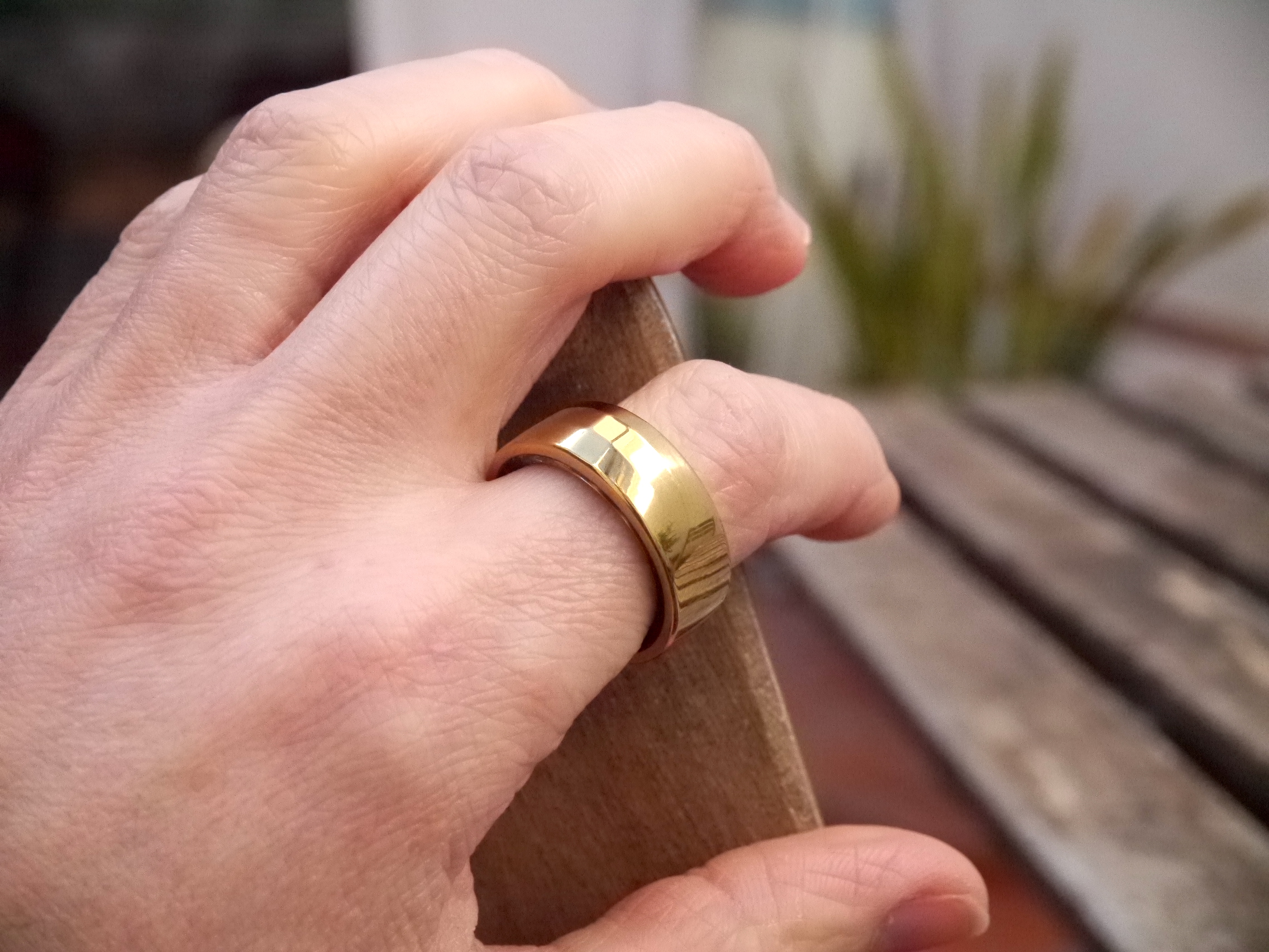
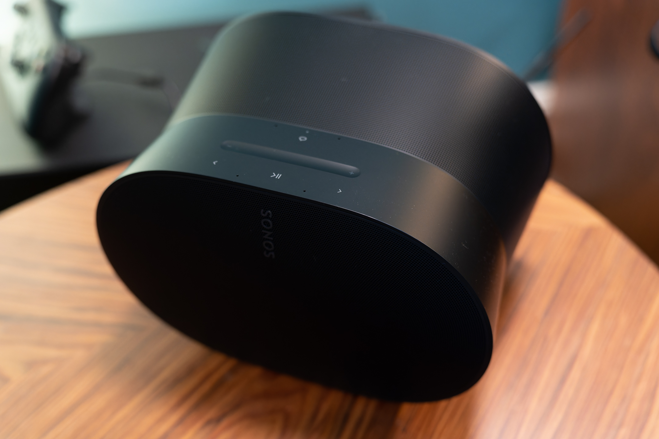
Image Credits: Natasha Lomas/TechCrunch
There are more data-points too: The Recovery index displays your lowest heart rate and average (in BPM) charted across the day; along with a chart showing heart rate variability (HRV), with an average & a max broken out as individual data-points. While the Movement index breaks out number of steps (as well as charting when they happened across the day); activity in METs (aka, metabolic equivalents), which is a measure of your rate of energy expenditure (again charted over time); active hours (& when they happened); total calories (estimated energy usage for the day); and your workout frequency.
The Sleep index is even more data-point heavy: Breaking out metrics for time in bed; total sleep; efficiency; average heart rate; average HRV (in addition to breaking out six individual score contributors as scored visual bar graphs). It also shows (still a feature in beta at the time of writing) Average Oxygen Saturation (or SPO2) as a percentage out of 100% (higher is better); sleep stages (awake; REM sleep; light sleep; deep sleep) — as well as breaking out the proportion you spent in each stage and displaying these across a graph so you can see when each of the various stages occurred as you slept.
Additionally, the Sleep index counts and maps movements (so it tracks how much tossing and turning you do); displays your lowest heart rate during sleep & the average HR, along with a line graph showing the fluctuations over the course of the night; HRV (average, max and a chart mapping the changes); and your temperature (also as an average and as a line graph).
The Ring tab also foregrounds your current HRV (+/- how many points off your average) and your skin temperature at the top level, i.e. without the user needing to drill down into specific indexes to get eyes on those metrics. Elsewhere, there’s a button for sharing an index overview, in a social media-friendly visual card form, if you’re inclined to want to quantify your metabolic health in public.
If all that sounds like quite the dump of data it absolutely is. But the app’s presentation of the tracking does at least foreground the three (proprietary) aggregate scores (Movement, Recovery and Sleep) — giving you an at-a-glance overview of how you’re doing in your quest for better metabolic health.
It also provides brief, text-based summaries, displayed directly under these index scores, to draw your attention to notable data-points and offer suggestions for actions you might take to try to boost your scores. So you don’t have to do the work of drilling down to look over all the contributor data-points if you can’t be bothered to get that geeky.
For example, if you have lower Recovery scores that day the app might suggest it’s “a good day to go for those long walks and try a non-sleep deep rest session”. Or if your Sleep scores are a bit off it might nudge you to “try sleeping a little more to improve your recovery and performance”. (More sleep? If only!) Or if you’ve been diligent about not being too sedentary it might reward you by observing your movement index “indicates consistency” — and “consistency is the key to good health!”. So go you!
But more granular data is definitely down there in the app if you go looking — so the product has been designed with committed biohackers in mind too.
Form factor & design: The ring’s the thing…
As anyone familiar with the plot of The Lord of the Rings could tell you, rings can be tricky things — with a habit of slipping around, and even sliding off, the finger.
Ultrahuman’s Ring is no different. A highly polished internal surface means it fits (ha!) in this somewhat slippy category despite having a chunky form. The startup does ship out a sizing kit before sending the product itself, so you can test different size options to try to find a snug-but-comfortable fit. However these dull plastic dummies clung rather more tightly than the actual Ring does. So I found the size I’d picked ended up being a bit looser on the intended finger when it was the real-deal in place.
The sizing kit recommended testing the dummies on the index finger. However I’ve actually ended up wearing the Ring on my thumb quite a lot of the time as the natural bump of the knuckle helps keep it on and it kind of gets in the way less of whatever I’m doing. It looks (and feels) fine here so this hasn’t been an issue aesthetically. But I was concerned it might affect data capture.
I asked Ultrahuman about wearing the Ring on a thumb vs a finger and it told me this digit isn’t the optimal choice: Rather the index, middle or ring fingers are best. But it did also say they’ve seen “many users” wear it “without inaccuracy” on their pinky fingers or thumbs. “When switching between fingers, there will only be data quality issues if the ring is loose on the fingers and isn’t fitting the way it is supposed to; a snug fit is recommended for accurate data capture,” it added.
Fingers themselves can be tricky things too, of course — swelling or shrinking depending on how warm or cold it is. There’s extra challenge because humans hands are frequently exposed to a variety of other conditions. So, naturally, these environmental shifts can affect the Ring’s fit. The upshot is some ongoing flux — whereby the Ring is either feeling snugger or looser depending on what’s going on around it that day or moment. I’ve therefore got used to needing to swap it between fingers in search of the best fit (or to avoid it getting in the way of whatever I’m doing).
For stuff like household chores (cleaning, chopping and washing veg to cook etc) and some forms of exercise (e.g. lifting weights) it seems least intrusive worn on the thumb (even if that’s not the most optimal placing for data capture). For a specialist activity like climbing I’ve actually had to remove it entirely — since you just don’t want anything getting between your skin and the climbing wall (and certainly not a chunky, scratch-able ring). So it’s not always possible to sustain the tracking, depending on your lifestyle.
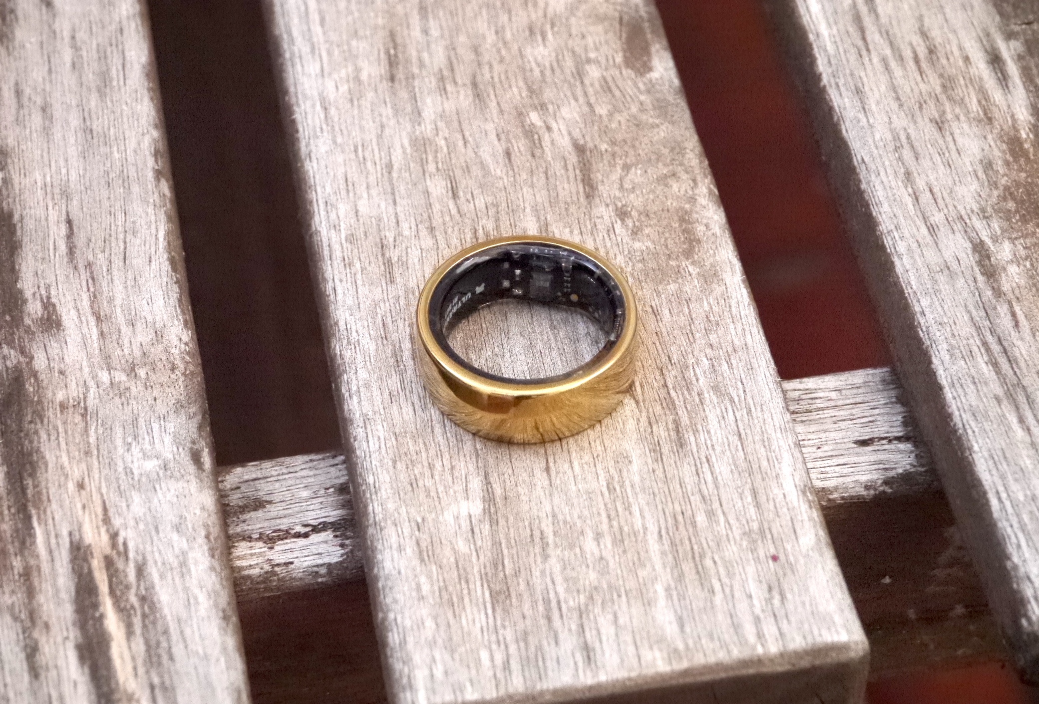
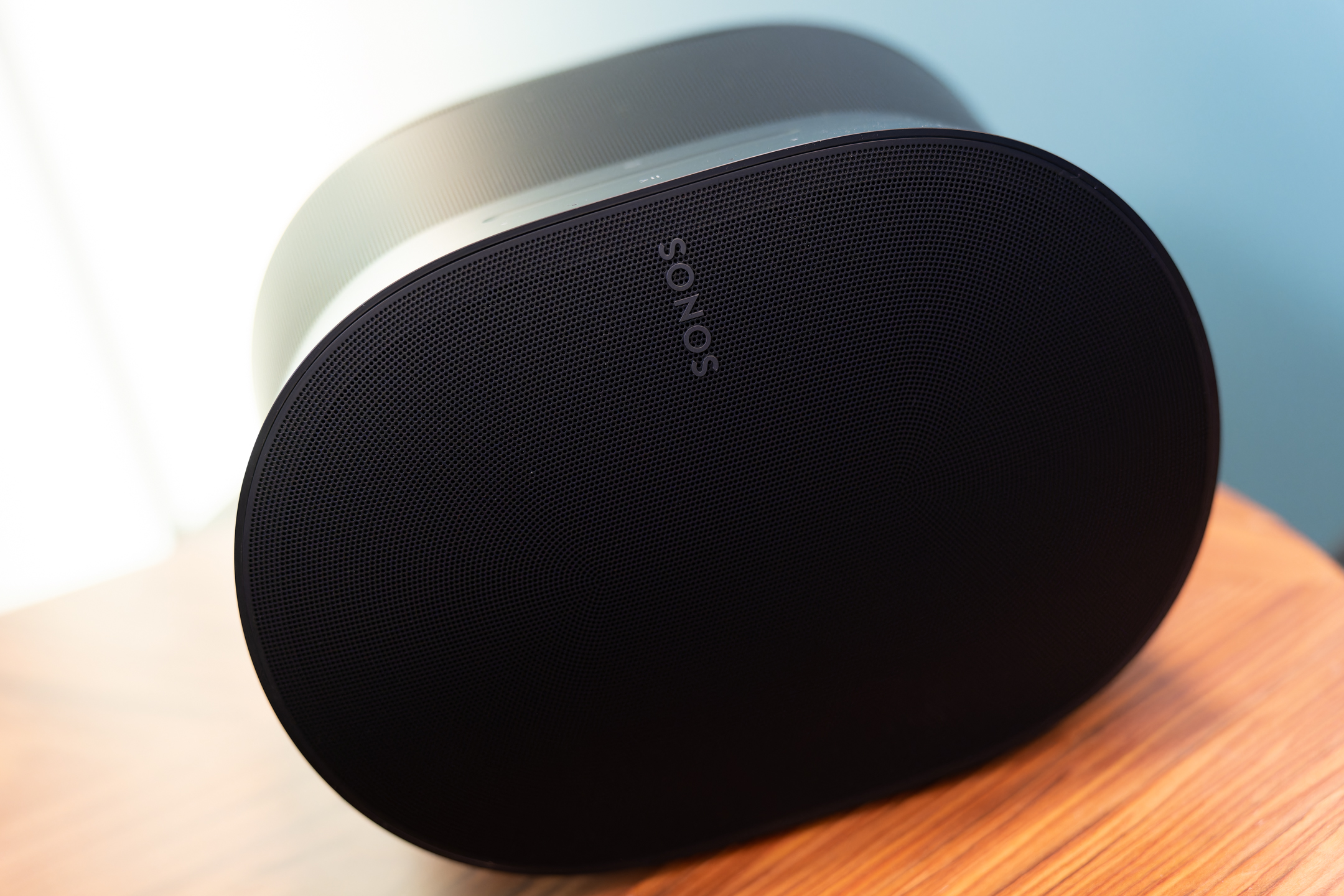
Image Credits: Natasha Lomas/TechCrunch
A more practical concern if you feel you must sometimes remove the ring entirely, is not only is there no data being recorded while you’re not wearing it but you might end up forgetting where you put it when you took it off — with the risk of losing it if you misplace it. I’ve definitely had a few scares over where I put it after taking it off. (And, I mean, just ask Gollum about that precious problem… )
So, on balance, I feel a wrist-mounted form factor (i.e. a band or watch) may have more advantages than a smart ring — being less intrusive for the user (even while physically larger); less exposed environmentally (to regular hand washing, moisturising etc); and at lower risk of being lost (since there’s less need to remove it entirely during the day). Wrist bands are also — IMO, as an owner of an Apple Watch — better suited for exercise-tracking since they’re less likely to get in the way of whatever activity you’re doing (throwing, lifting, pulling, swimming etc) since they naturally sit more securely on the body.
They also seem less likely to get damaged as a result of vigorous exercise as wrists tend to be more shielded from activity than hands.
It seems no accident that fitness trackers started as bands and took over the smart watch category. So a ring form factor does seem a bit of a left-field choice for a fitness-focused health tracker. After all, rings have — traditionally — had a largely decorative purpose. Or, well, exist to signify a certain type of relationship. And smart hardware isn’t typically prized for its aesthetic qualities. So unless you’re after a more decorative look step/sleep tracker a smart ring doesn’t seem the obvious pick for such a purpose.
Commercially speaking, of course, you can see why a startup would not be keen to go toe-to-toe for wrist real-estate with heavy hitters like the Apple Watch. Smart ring hardware thus offers the chance for startups to carve out a fitness tracking niche that can at least supplement (if not entirely supplant) more mainstream wearables. (And more newcomers are making smart ring moves — see, for e.g., Movano Health’s plan for a female-focused twist on finger-mounted tracking.)
Form-factor reservations aside, Ultrahuman’s Ring does look pretty nice, as this sort of chunky-look jewellery goes.
The gold version of the Ring I was testing looked and felt fine (slippy-ness aside). It was a bit bulky but I have small hands so your bandwidth on that may vary.
There’s a choice of colors and finishes — including some attractive-looking black and silver options — and a subtle geometric pattern to distinguish a ‘top’ from the rest of the band without making it fussy or overtly gendered. The startup says the Ring is made of Titanium with a “scratch resistant” Tungsten Carbide coating. This external metallic coating wasn’t immune to scratching — and, over several weeks of wear, the kind of patina you’d expect to develop on a piece of metal jewellery duly appeared. But, to my eye, this didn’t detract from the overall look.
The hardware design also seemed solid and robust, dealing ably with the shifting demands thrown at human hands — and throwing up minimal connectivity issues (but expect a short lag in the morning as it reconnects and offloads data). So I didn’t have any big quibbles with reliability or the hardware’s look and feel. Rather it’s the smart ring as a form-factor that raises questions for me around relative functional utility for this sort of fitness-focused use-case.
For some very active people a wrist-mounted tracker is likely to be a more practical choice most of the time. (It’s no surprise that athlete-focused plays like Whoop have gone for the wrist, for example.) That said, being as a ring is smaller than a wrist band or watch, it may be more comfortable for some people to sleep in. And for those looking for a wearable for sleep tracking, especially, Ultrahuman’s Ring might fit the bill better than a more bulky type of band. (That’s not my own experience with wearing an Apple Watch overnight, but, well, these are subjective kinds of considerations so what works or doesn’t may depend on the person.)
I was a little concerned the ring might pinch my fingers at night — given how body temperature (especially for women) can vary and may mean fingers sometimes swell a little during sleep. I did notice it seemed to fit a bit more snugly in the morning. But, again, I felt I could get around this concern by choosing a bit of a thinner digit overnight. So, again, provided this doesn’t cause a hit to data consistency there are ways to work around this sort of fit concern.
One more thing on form-factor: Ultrahuman has suggested its Ring can record biomarkers such as heart rate more accurately than an Apple Watch given its sensors are taking measures more often. The accuracy of the biometric data being captured by wearables is device specific and an ongoing area of debate — so more research is likely needed before any firm conclusions can be drawn — but as it also notes accuracy may depend on how well fitted the Ring is then, given changeable real world conditions, the ‘quality’ of the data capture seems likely to vary too. Which adds complexity to these kind of comparisons.
Performance & user experience
Ring + CGM
Having road-tested Ultrahuman’s CGM-based metabolic fitness tracking program back in 2021, an experience I wrote up in my January 2022 review (for those after a deep-dive into health tracking with a CGM), I had high hopes for what the combination of the Ring + CGM would mean for the metabolic insights the platform could provide. An issue I flagged in that earlier review was how the app wasn’t able to automatically distinguish between blood glucose spikes caused by exercise (which, on manually logging your workout, the app will inform you are “good” spikes) and those related to food (the bad spikes).
The issue is that while manually logging exercise — or integrating with another wearable, like the Apple Watch, to sync your tracked workouts — provides the app with a signal that activity is happening it can still give a low score to a meal you ate in close proximity to a workout because of how long you spent over the target optimal glucose range (even if the spike was due to an intense workout, not because of what you ate).
Given the Ring can sense movement I was expecting the tracking to have got smarter about distinguishing workout-triggered spikes from food-related spikes. In the event, it still seemed to struggle with this. I found, for example, that meals eaten close to intense workouts would typically still result in a lower score than they might otherwise have done because glucose elevation after the workout contributed to “time over target” (a negative metric) regardless of the quality of the food choices.
Exercise is not the only other potential trigger for a glucose spike, of course. Poor sleep and stress can elevate blood sugar (neither of which are good, obviously). But during testing I even noticed blood sugar could shoot up as a result of a simple ambient temperature variation. Changing clothes in a cold room, for instance, could cause a large enough rise in glucose for the app to warn me about the need to “get movin'” as the critical metric shot over 120 — whereas optimal glucose, which it nudges you to try to maintain, is between 70-110 mg/dL.
Asked about the challenge of making sense of good vs bad spikes, Ultrahuman co-founder Mohit Kumar agrees it’s a “tricky” area — describing it as “a bit of a heuristic problem to be solved”. “Personally, I also get unimpressed by our ability to not distinguish between these two things,” he told TechCrunch. “So we have to take a shot at it and see — how do people react?”
One approach Kumar suggested the team may explore is to adapt the metabolic scoring around these types of events — but with a warning that scores will only be accurate if the user is accurately logging their food intake. Or else only offer this kind of adaption to those who are thoroughly logging their food to avoid the risk of reducing the overall accuracy of the platform for the average user.
On the food logging front, it’s fair to say most users are unlikely to be doing this entirely accurately. Firstly because logging everything you consume is just tedious. But, beyond that, it’s also not always possible to be entirely accurate about what you’re eating — either because the exact thing you ate isn’t listed in the app’s inventory (and custom food entries won’t be structured data that the app can automatically interpret); or you don’t know the exact quantity of each of the ingredients consumed. (The app has a section displaying “total macros” — which counts cumulative calories, protein, fat, carbs and fiber as you log your meals over the day — but the figures it displayed for me were never accurate since I wasn’t weighing and inputting every single ingredient I ate individually.)
Beyond that, you might not even know all the ingredients in what you’re eating. Meals you didn’t prepare can come larded with all sorts of unexpected additions — so if you’re eating out a lot, getting takeaway or eating pre-prepared/packaged meals then food logging can be extra challenging. (And if testing a CGM has taught me anything it’s that sauces are often a minefield of hidden, sugary ingredients.)
The upshot is meals you might not expect to be bad for glucose stability can still surprise you with a spike. Which is also why figuring out what’s a good vs bad increase in blood glucose remains tricky algorithmically, even with access to more data than ever — in the M1 + R1 scenario. Hence why this remains a work in progress for Ultrahuman.
What did the Ring add to the M1 blood glucose tracking experience? In addition to getting a whole new tab chock-full of Ring biomarker data to geek out on, the app blends additional notifications into the main metabolic tracking timeline.
For example, it might drop in with an affirmative clap on the back for being “pretty active today” — or an even bigger plaudit for “achieving your steps goal of 10,000 steps”. Or it might inform you your “heart rate dropped early” (during sleep) — observing that “helps improve sleep quality and recovery”. Or, if you went for a walk after a meal and being active helped manage down the food spike, it might pop up to offer a thumbs-up for the “great job keeping the metabolic score in the target zone”. Or, on the flip side, if you’re slaving away at your desk for hours being sedentary, it might ping over the suggestion: “Time to move?”, along with a nudge that “moving frequently helps with better blood circulation and energy balance”.
Some of these nudges feel pretty similar to stuff you’ll find on a mainstream wearable like the Apple Watch — which, for example, has a feature that can literally tap you on the wrist to encourage you to stand up and walk around a bit every hour. So how useful some of the app’s more basic ‘activity needling’ notification are is likely to depend on whether or not you already own a smart watch as there may be some duplication in functionality.
However, Ultrahuman’s app also sent some more interesting compound notifications — such as the one above in which it links going for a walk after a meal to positively managing down a blood glucose spike — which are clearly distinct vs mainstream wearables. And this is where there’s added value to be (data)-mined — if it can join more dots and make accurate and actionable correlations between the user’s lifestyle and improved blood glucose regulation.
A wearable that’s able to do the smart lifting of connecting lifestyle factors with metabolic outcomes seems more likely to be successful at motivating users to make behavioral changes that can add up to big health positives over time. Because, as we know, just telling someone to do something doesn’t tend to get a great response. But if you’re nudging them in a way that shows them what happened as a result of something they did it it could lead to a eureka moment where the person is inspired to own the change for themselves. That’s the really big promise glimpsed here.
I say promise because it’s still early for the Ring + CGM. Ultrahuman’s approach to notifications and nudges is clearly still a development work in progress (the product roadmap shows a pipeline of features upcoming and even some new and as yet undisclosed biomarkers).
But if they can roll on, crunching the data and more tightly correlating lifestyle choices and blood glucose fluctuations — and use those insights to design more of these smarter nudges that help people understand the impacts (good and bad) of how they’re living on their health — the potential for the program to deliver a transformative step-change in the power of this type of health tracking looks big.
They’re not there yet, though. For now, a lot of the Ring’s pings can seem more abstract than joined up and it’s often not clear how the user should respond.
For example, the one above about heart rate dropping early during sleep sounded good but I didn’t know what I might have been doing right for that to happen. Or how, therefore, I should response to that bit of positive feedback — aside from, well, just carrying on? The user experience can therefore sometimes feel quite passive — in an ‘oh that’s nice (or not so nice) to know but now what?’ kind of a way.
It seems clear that the most effective behavioral nudges are going to be those that actively engage people by showing them the agency they have to influence their own outcomes. At the same time, there’s no doubt what a complex endeavour that entails since so many factors can feed into (or take away from) being healthy.
Limits also remain on how much we know about the interplay between bodily inflammation and long term health. Even interpreting individual metabolic biomarkers can be challenging — such as HRV, a sensitive measure based on tracking the time between heartbeats which aim to quantify the performance of the automatic nervous system and act as a biomarker for bodily stress and rest and recovery but which can also be impacted by chronic inflammation and disease, so knowing how to read a ‘low’ HRV score isn’t simple).
Metabolic health certainly its own particular set of considerations and challenges. And it’s important to note there is still some scepticism of the value for a general consumer, with no specific medical need, to be tracking their daily blood glucose swings. So a product that’s predicated on nudging all sorts of people toward potentially beneficial lifestyle changes — which might, over time, stack up into a meaningful positive for their overall health (or “longevity”) — is necessarily on a journey to design the best approach to achieve optical outcomes for all types of users.
That journey is, evidently, a bit of a balancing act too. (Or even a juggling act when you throw in life’s other typically less health-promoting demands on users’ time and mind.) So iterations and adaptations are to be expected as part of the push to “decode” metabolic health, as the pitch goes.
A quick shout out for the (human) “performance coaches” that Ultrahuman’s app also puts at your disposal via text chat.
These sports scientists and exercise physiologists — which it touts as being “NSCA-CSCS certified with years of diverse experience in training elite athletes and designing performance and rehab training programs” — are there to take questions as you navigate the highs and lows of blood glucose tracking. And, if you give your consent, they can analyze your CGM + Ring data to suggest some personalized lifestyle biohacks.
One example: I had a great experience with a coach called Mugdha who smartly identified the reason why I was regularly getting glucose spikes after lunch and dinner — meals I had thought were balanced and healthy (made of whole foods, with plenty of fiber from veggies plus a good source of protein) so should have meant I stayed within the optimal range. The problem was I was eating a piece of fruit after each meal which was pushing me outside the target range and triggering a bunch of glucoses crashes later on.
We’re endlessly told fruit is healthy for us so it was not something I’d even thought might be a problem. Turns out how you eat fruit is important: The simple biohack the coach suggested was not to eat fruit with main meals; instead try having it as a snack between meals. This tiny change doesn’t make a material difference to my lifestyle but it made a quantifiable difference to how many of my meals spiked — and, therefore, fed into improving my overall metabolic score. Which is pretty nuts — or, er, bananas! — when you think about it.
It’s also interesting that it took a trained human (rather than AI) to spot that issue in my data and provide this super simple fix.
Another couple of fun observations: While wearing the M1 I took the opportunity to road-test a few foodstuffs that are billed as healthy to see what my own metabolism made of them. Namely: Beyond Meat sausages (a vegan alternative to meat). Huel‘s hot & savory “instant meals” (a UK-based Soylent competitor). And the breakfast and dinner recipes of (in)famous biohacker, Bryan Johnson — who open sources all his data as part of his multi-million dollar quest for longevity via epigenetic age reversal (or, well, as close as I could get to recreating his Nutty Pudding and Super Veggie — shrinking the latter to a more realistic portion size for a normal person’s lunch, so like 3x less).
I had a decent metabolic response to the Beyond Meat sausage, eating one of these (mostly pea protein-based) vegan sausages accompanied by steamed and stir fried fresh vegetables. Although the app combined this meal with an intense workout I did before that had elevated my glucose levels — meaning the combination only scored 5/10 (as a result of a 31 mg/dL rise in glucose that kept me out of range for 36 minutes+). Less good: Huel’s Mexican Chilli — eaten alone as it’s billed as a complete meal if you have 2x scoops — which caused a 41 mg/dL rise in glucose that kept me out of range for at least 70 minutes, earning the dish a 3/10 score in the app. I imagine the high cereal-based carb content is what triggered me there. Still, it was not as bad as actual Mexican food: One takeaway meal I ate, consisting of guacamole & tortilla chips plus a veggie taco, scored a big fat ‘0’ on a 68 mg/dL rise after causing 96 minutes+ out of range. So, er, eat tortilla chips at your peril!
Bryan’s Nutty Pudding was given two scores in the app since it initially evaluated it on its own (6/10, on a 40 mg/dL rise that kept me out of range for 10mins+). It then revised the score after I drank a cup of green tea shortly afterwards — scoring that combo a 10/10 because of “minimal glucose change”. But, again, that illustrates the complexities of trying to link even something as relatively straightforward as a change in blood glucose to a specific meal. On balance I think the more accurate score there is the lower one — whereas my own chia pudding breakfast concoction reliably scored higher than 6/10 (so feel free to ping me for the recipe Bryan!). The Super Veggie dish was, perhaps surprisingly, a low scorer (4/10 on a 46 mg/dL rise that kept me out of range for 38 minutes+). But I have found that lentils do seem to spike for me. I would probably have a better response if I dialled back the proportion of lentils and ate more of the other veg… All of which is to underline how insanely personal all this stuff is! Or: What’s good for Bryan won’t necessarily be optimally metabolised by someone else.
It’s also important to remember that a meal is not just food; it’s fuel. So if you’re going to be active after eating you might want to load up on carbs to ensure you are properly energized for your workout. Whereas for desk workers stuck in a chair it’s the opposite scenario. And in the former case Huel, for example, might be a great choice for an energetic pre-workout meal. Basically, you can’t just look at meals in isolation. It depends what you’re going to be doing throughout the day. Hence why tracking and quantifying lifestyle for health and fitness needs to span a variety of factors.
One future scenario for Ultrahuman’s platform might be that it gets smart enough to be able to make increasingly contextual suggestions and do so more pre-emptively than it can now — so, for example, not just nudging you to “get movin'” as your glucose shoots out of range but maybe even popping up at the point where you’re logging your food to say: ‘Hey, this dish looks like it’s going to give you an real burst of energy — so think about pairing it with a workout!’.
As it stands, you do still have to do a lot of the leg work of navigating how to respond to the data yourself if you want to get the most out of the CGM experience.
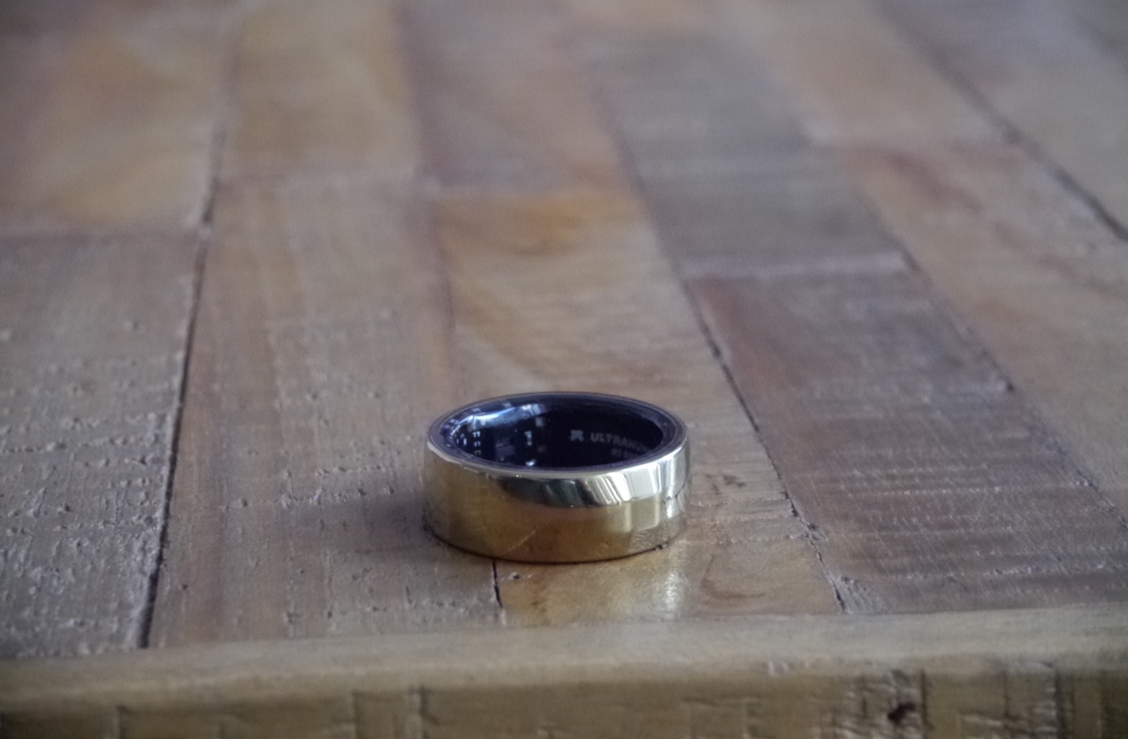
Image Credits: Natasha Lomas/TechCrunch
Just the Ring
You don’t need to be wearing a CGM to make use of Ultrahuman’s Ring; it can also function as a standalone health tracker. But in this scenario it’s a lot more vanilla — since there’s no on-board glucose tracking. The focus for the smart ring is on tracking rest and recovery, as well as keeping tabs on how sedentary you are — so the functionality may be of interest if you’re either A) not very active (and have low energy levels) and want help to improve that. Or B) if you’re active and are looking for a device to monitor how well rested you are and also to help with programming your training.
Clearly, there’s plenty of competition for both these scenarios — from the Apple Watch to rival smart rings like Oura’s — so Ultrahuman’s Ring alone definitely loses a differentiating edge. And, personally, in the case of the activity tracking use-case, I’m not sold on a smart ring form factor vs using a wrist band or watch, as discussed above. But others may prefer a smart ring — which lacks a distracting screen of its own.
On the activity tracking side, you get Fitbit-like movement tracking features (steps, activity and workout mapping etc) plus some Apple Watch-esque nudges (via in-app pings) which are designed to work against being too sedentary.
The Ring’s Recovery feature is intended to function as a daily guide to training — offering a summary for how hard to push in your workouts based on how well rested and recovered it reckons you are. Although more athletic users are likely to prefer something more granular and powerful for workout tracking — such as a more athlete-focused tracker service, like Whoop.
I’m not entirely convinced of the usefulness of a ‘digital coach’ feature. Especially as, in the Ring’s case, it seems super light touch — offering very broad-brush advice — to push harder that day, or “proceed as planned”, or take it a bit easier — rather than serving up more tailored and specific training or recovery recommendations. And being as it’s so general, most of the time, you’re surely going to be able to go with your gut feeling, vis-à-vis how much energy and pep you have on a given day or how tired you feel — so I question why you need an app to tell you how your body already feels?
So my sense here is the average user may struggle to find a great deal of standalone utility in the Recovery Score feature — unless they value the personalized notification as a motivator for exercising more. Or they’re taking the time to drill down and monitor changes to Recovery score contributors in a way that helps them diagnose why they’re feeling less up for it than usual on the running track etc (and use the data-points to course correct, by getting more sleep etc).
Although, again, a simple hack we all know for improving our recovery is to just get more sleep. And you don’t need a tracker to do that.
The area that seems to be the biggest focus (currently) for Ultrahuman with the Ring is sleep tracking. As noted above, this section of the app is very data heavy. During the testing period it also added an additional biomarker: SPO2 — for overnight blood oxygen tracking — so it’s evidently keen to keep expanding what it’s offering here.
The goal may be to put some clear blue water between the Ring and other mainstream wearables like the Apple Watch, which offers a far more basic sleep-tracking experience. So if you’re really focused on quantifying how well rested you are (or are not) — and on trying to figure out exactly what’s getting between you and the good Zzzs — Ultrahuman’s data-heavy approach may be a lure.
It does make sense for the startup to want to hone in on sleep for the other part of its hardware play (the CGM-based tracking) given the key role sleep plays in glucose regulation (and indeed in Recovery) — and therefore to overall metabolic health. However I do have a bit of a reservation over the granularity of the sleep tracking if you’re just using the Ring.
Firstly, for the average user, it might just feel a bit much — and even a bit stressful. And that could end up being counterproductive to the overall health mission.
Secondly, it’s not necessary in our gift to get more sleep than we already do. So receiving regular nudges about the need to get more (and better) shut eye are not necessarily very useful. Most of us probably know we should get more sleep and would surely love to be able to spend more time resting in bed if we could. But the demands of work and life do tend to get in the way. Which is why we end up burning (at least) one end of the candle more often than we’d like.
Sadly, it would require a lot more than the odd in-app nudge to fix society’s chronic sleep deficit problem. (A wealthy patron who could fund our lifestyle without the need for us to work, say. Or children (and pets) who sleep soundly through the night — and/or a partner who never snores. Or a city that actually sleeps. And so on… )
So, well, do we really need an app nagging us about something we likely know but can’t necessary change? And, well, waking up to a daily sleep score that’s not optimal can just feel bad and stressful. So is this kind of granular tracking really the ideal way to encourage better quality rest and recovery? I’m not 100% convinced.
That said, I suspect it this depends on the person. Some people may thrive from being able to analyze all sorts of sleep metrics — and on trying to self-diagnose and remove particular barriers standing between them and better rest. While others may just feel overwhelmed.
Ultrahuman’s philosophy, generally, is geared toward arming users with ample data (those aforementioned Sleep Index score contributors in this case) to encourage them to do the work of trying to connect biomarkers to lifestyle choices and so figure out how to edit their life to try to optimize their scores. But of course not everyone is going to engage with such a data-driven approach. And, clearly, a data-loving biohacking community is more likely to want to dig it and geek out than a general interest consumer — who wants and expects a lot more hand-holding (and even heavy lifting) from their products.
Another issue with the Sleep Index is it can feel especially abstract — in that it can be difficult to know exactly what’s been referred to, let alone how you might go about correcting any poor scores you’re getting. (Beyond the obvious fix of just getting more sleep.)
So, for example, if the app suggests your “sleep efficiency” or “timing” is a problem that “needs attention”, presumably that refers to A) how long you spent actually sleeping while in bed vs time in bed; and B) when you went to bed vs the optimal window based on circadian rhythm. But, well, 1) it’s probably not immediately clear to an average user what those labels mean; and 2) as noted above, even if you drill down into the explainer to try and figure it out few users might feel they have heaps of human agency to fix either of those types of sleep disruption issues. (Not in this hectic life anyway… as the saying goes: ‘I’ll sleep when I’m dead.’)
Another example is temperature which also feeds the overall Sleep Index score. The app regularly informed me my temperature was elevated but it was impossible to know what to do with this information. I didn’t feel ill or have a fever so I was left wondering if the hardware and algorithms were properly calibrated for women (as women tend to have more body temperature fluctuations than men).
Ultrahuman told me they have done “a small adaptation” for women — to account for this greater temperature variation factor. So I even got to wondering whether something environmental, like extra layers of winter bedclothes, might be contributing to these elevated temperature scores. I never figured out exactly what was going on. The app’s vague suggestions for possible caused never seemed to fit. So it remained a bit of a mystery.
The startup told me the Ring actually takes two temperature measures: Ambient temperature and skin temperature, which it uses to try to deduce core body temperature — which it’s tracking so it can offer features like fever detection but also because it says temperature can be an important marker for health in terms of inflammation related to recovery.
It told me elevated temperature can be a signal of over-training. Or it could be linked to a thermodynamic effect of food (or alcohol, although I wasn’t drinking at all during the testing phase so could discount that). Or to lack of sleep… So, in short, it’s complicated!
Ultrahuman recommended the metric is used in conjunction with other biomarkers the app tracks to try to narrow down whether there’s an “actionable” insight to be had off-of a “needs attention” reading on it or not… But, again, I wasn’t able to figure out what it might be linked to in my case. And the example underlines the challenge of intelligently interpreting so much data. (Temperature is just one of some ten or so biomarkers feeding the three Indexes — so there’s a lot of potential linkages and amplifications to consider).
The upshot, for an average (most likely under-rested) Ring user, is the Sleep index can be a frustrating part of the app. And frustration can generate stress which can negatively impact metabolic health and sleep itself… So there could be a risk of over-tracking itself being counterproductive to the healthy-purpose the product is shooting for.
The same can be true for food tracking, via the M1, too of course. But at least when it comes to food there’s more bandwidth for making small tweaks (even just to the timing of meals, as with the fruit example discussed above). Plus Ultrahuman’s in-app coaches are on hand to analyze your food logs with an expert eye and offer intervention suggestions that don’t necessarily require major behavioral changes.
But biohacking your way to better sleep? It’s a notion that’s far more experimental — and seems even more socioeconomic-class dependent — than other types of lifestyle interventions. (And of course very few of us have the wealth of a Bryan Johnson to dedicate to implementing optimal shut-eye schedules.)
Despite this, Ultrahuman is leaning into biohacking sleep. Discussing the recent addition to the Sleep Index — SPO2 — Kumar suggested users could act on a low score for overnight blood oxygen by experimenting with mouth taping, a non-scientifically verified practice than involves taping the mouth during sleep to encourage the body to breathe through the nose instead.
The experimental ‘sleep hack’ went viral in recent years, reportedly after being promoted by TikTok influencers. The claim is it helps retrain the body to breathe through the nose rather than the mouth — promoting deeper and more restorative breathing and oxygenation during the night. However there have been only limited scientific studies into the practice and there’s not enough evidence to confirm whether the technique is really helpful or even entirely safe. (And plenty of doctors have warned against trying it out.)
So while having the SPO2 data-point in the app might be a useful signal for a user to initiate a conversation with their doctor — if they are concerned they might have sleep apnea — it’s not a metric you can necessarily do much with, practically speaking, day-to-day (not unless you’re willing to test out a viral TikTok trend on yourself). So there may be limited value in showing the user a daily percentage score if they can’t really do much to improve it. Tracking trends (up or down) for them is where the app will want to get to.
Zooming out, a more general niggle I had with the Ring’s UX is I often found its messaging contradictory vs the data-points it was reporting — and/or out of step with the real-time reality of what I was doing. The Index scores especially often felt out of sync with how I felt (i.e. well rested/recovered or not) — or how much I’d recently moved.
For example, drilling down into the Recovery Index one day I was met with a notification that “your resting heart rate is on the lower side today. This indicates better rest and recovery”. However the positive-sounding feedback was displayed directly above a bank of “recovery score contributors” almost all of which were in the red, including “resting heart rate”, specifically — which was listed as “needs attention”. The overall Recovery Score at that moment was also 64 (out of 100) — which in pure numerical terms doesn’t look worth celebrating.
In another visually contradictory instance, the app displayed a score of 100 for the Movement Index one morning (presumably as I’d got a late night walk in). Yet the text below this read: “Your recent movement index trends indicate you’ve been moving lesser than usual. Today’s a new day to get back on track.” (The word “trends” here suggests it’s looking at more than the most recent movement data but the presentation of the two so close together is disjointed and risks being confusing.)
Another example followed a sleep-related notification which informed me of “optimal recovery detected” — along with text that read: “Your HRV is trending higher than the previous night. This is a marker of improved rest and recovery”. Great, you’d think. However the Sleep Index contributors displayed directly below this showed HRV in the red (“needs attention”). So, er… 
The challenge here — aside from the headline one for any health/fitness wearable of intelligently interpreting what the tracked biomarkers actually signify for the user (and suggesting useful lifestyle tweaks or behavioral changes without turning them off) — seems to hinge on balancing how much/granular data to show while also pulling from the data on their behalf to distill and display trends in a way that makes sense based on what the user is experiencing and any other data-points being made available to them in the app.
At times, the Ring tab felt pretty baffling in this regard.
More clearly separating trends-based observations from real-time data-points might help. Even just by putting more visual emphasis on trends vs individual data-points — since, ultimately, trends and smart notifications is where the average user should be directly most of their attention.
But, as discussed, the Ring is still a beta product. So let’s see how this element evolves. (A recent addition by Ultrahuman in this area is emailed “weekly insights” — which it says it hopes will help users “understand their metrics in a longer trend line”.)

Image Credits: Natasha Lomas/TechCrunch
Bottom line
Health tracking and biohacking is not new in consumer tech terms but in some ways the field still feels like it’s just getting started as the challenge of decoding all the biometric data that sensing wearables are picking up just keeps stepping up.
CGM technology, with its near real-time window onto blood glucose levels, provides an especially fascinating — and relatively recent — addition to the mix. One which holds the promise of powering truly personalized interventions that could move the needle for all sorts of people — in a way that general healthy lifestyle advice, about the benefits of eating well and getting enough exercise, all too often won’t. But it’s also clear that cutting-edge products in the category are still grappling with how best to interpret and present the information they’re tracking. So, at times, the user experience can feel experimental and immature.
Ultrahuman’s platform is no exception — perhaps especially as it took a ‘reverso’ approach which started with CGM hardware and has only now bolted on general fitness tracker, adding a set of more familiar biomarkers to the blood glucose-driven metabolic scoring it started with.
Adding the Ring to its hardware mix may not only serve to widen the appeal of its platform by attracting a more general consumer (who would never be fine firing a CGM into their arm), but could help the startup dial up critical differentiation in the category — by providing it with more data to identify correlations between blood glucose-related inflammation and lifestyle factors. The key will be figuring out how best to package insights into actionable and effective behavioral nudges — interventions that might even be applied more broadly if (or when) blood glucose tracking doesn’t require a semi-invasive CGM… So Ultrahuman’s team has got plenty to keep them busy.
For now, the combo of the Ring plus CGM shows clear flashes of potential for unlocking smarter interventions as we get a tighter understanding of how a person’s lifestyle impacts their metabolism. New features were being introduced over the period I spent with the beta product, with lots more slated to come, so the experience continues to evolve at pace. But in the not too distant future it looks a pretty safe bet that some of the cutting-edge tracking being pioneered by startups like this one will bleed out into the mainstream.
Taking Ultrahuman’s sleep & fitness tracking Ring for a spin by Natasha Lomas originally published on TechCrunch