Steve Thomas - IT Consultant

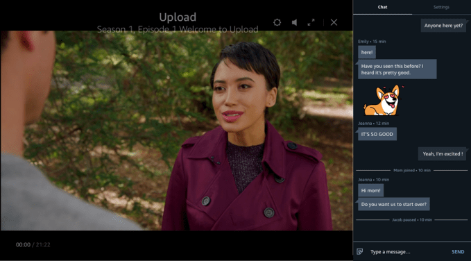
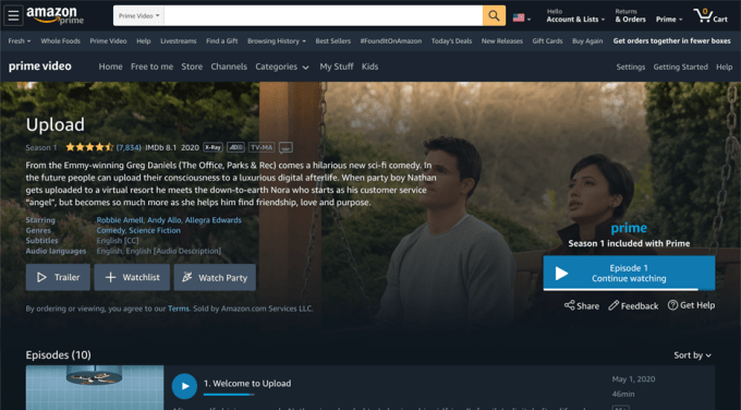
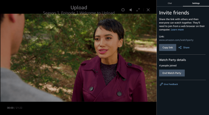
Amazon Prime Video is beginning to roll out a coviewing feature to Amazon Prime members in the U.S., the company announced today. The “Watch Party” feature, which is included at no extra cost with a Prime membership, allows participants to watch video content together at the same time with the playback synchronized to the host’s account.

The host of the cowatching session will be able to start, stop and pause the Watch Party as needed throughout the session, and those changes will also be synced to all participants’ devices instantly.

Each session can also support up to 100 participants — as long as those participants also have a Prime membership (or a Prime Video subscription) and are are watching from within the U.S.

While the video is playing, users can socialize with other participants through a built-in chat feature that supports both text and built-in emojis.

At launch, Watch Party is offered via Prime Video on the desktop and is supported across thousands of titles in the Prime Video SVOD (subscription video on demand) catalog. This includes the third-party content that comes with Prime as well as Amazon Originals like “Fleabag,” “The Marvelous Mrs. Maisel,” “Tom Clancy’s Jack Ryan,” “HANNA,” “Mindy Kaling’s Late Night,” “Donald Glover’s Guava Island,” “Troop Zero,” “The Big Sick,””The Boys,” “Homecoming,” “My Spy,” and others.

Titles available only for rent or purchase are not available within Watch Party at this time, Amazon says.

To get started with Watch Party, customers will click on the new Watch Party icon on the movie or show’s page on Prime Video desktop website. They’re then given a link they can share with friends and family however they want. Recipients who click the link will then join the session and be able to chat with others.

Amazon says the new feature was built as a native experience for Prime Video.

The company is the latest streaming service to roll out bulit-in support for coviewing — something that’s become a popular activity during the coronavirus pandemic as people are spending more time at home.

While the U.S. was sheltering in place under coronavirus lockdowns, a browser extension called Netflix Party went viral. Soon, all the streamers wanted in on this action. HBO, for example, partnered with the browser extension maker Scener to offer a “virtual theater” experience for cowatching that supports up to 20 people.

Hulu more recently launched its own native Watch Party feature for its “No Ads” subscribers on Hulu.com. Media software maker Plexa also rolled out cowatching support around the same time.

Amazon, however, had already offered a way to cowatch some of its Prime Video titles before today. Its game-streaming site Twitch had introduced Watch Parties this spring across over 70 Amazon Prime Video titles. The new native experience rolling out now offers a broader selection and has the potential to expand to more markets in the future.

If you don’t see Watch Party yet, you will have it soon as the feature is just now beginning to roll out more broadly.

Amazon wouldn’t comment on its future plans for Watch Party. When asked about the roadmap ahead, the company would only say that it introduces features when they’re ready for customers.

A new paper published by Disney Research in partnership with ETH Zurich describes a fully automated, neural network-based method for swapping faces in photos and videos – the first such method that results in high-resolution, megapixel resolution final results according to the researchers. That could make it suited for use in film and TV, where high resolution results are key to ensuring that the final product is good enough to reliably convince viewers as to their reality.

The researchers specifically intend this tech for use in replacing an existing actor’s performance with a substitute actor’s face, for instance when de-aging or increasing the age of someone, or potentially when portraying an actor who has passed away. They also suggest it could be used for replacing the faces of stunt doubles in cases where the conditions of a scene call for them to be used.

This new method is unique from other approaches in a number of ways, including that any face used in the set can be swapped with any recorded performance, making it possible to relatively easily re-image the actors on demand. The other is that it kindles contrast- and light conditions in a compositing step to ensure the actor looks like they were actually present in the same conditions as the scene.

You can check out the results for yourself in the video below (as the researchers point out, the effect is actually much better in moving video than in still images). There’s still a hint of ‘uncanny valley’ effect going on here, but the researchers also acknowledge that, calling this “a major step toward photo-realistic face swapping that can successfully bridge the uncanny valley” in their paper. Basically it’s a lot less nightmare fuel than other attempts I’ve seen, especially when you’ve seen the side-by-side comparisons with other techniques in the sample video. And, most notably, it works at much higher resolution, which is key for actual entertainment industry use.

The examples presented are a super small sample, so it remains to be seen how broadly this can be applied. The subjects used appear to be primarily white, for instance. Also, there’s always the question of the ethical implication of any use of face-swapping technology, especially in video, since it could be used to fabricate credible video or photographic ‘evidence’ of something that didn’t actually happen.

Given, however, that the technology is now in development from multiple quarters, it’s essentially long past the time for debate about the ethics of its development and exploration. Instead, it’s welcome that organizations like Disney Research are following the academic path and sharing the results of their work, so that others concerned about its potential malicious use can determine ways to flag, identify and protect against any bad actors.

Like it or loathe it, video has proven to be the most engaging of all mediums across the web, and today a company out of Israel called Artlist — which provides royalty-free libraries of music, sound effects and even video itself to enhance video content — is announcing a significant growth round of $48 million, both to continue its expansion, and to build better technology to help navigate users to the perfect clip.

The funding is being led by KKR, with participation also from Elephant Partners, a VC out of Boston that has also backed Allbirds, Scopely and Keelvar among others. This is the first funding that Artlist has ever announced, although Elephant had backed it with a previously undisclosed amount previously. Ira Belsky, Artlist’s co-CEO who co-founded the company with Itzik Elbaz, and Eyal Raz and started as a filmmaker himself, said the company has mostly been bootstrapped since being founded in 2016. It’s not disclosing the total amount raised to date, nor its valuation except to say that it’s on the rise.

“We have been 100% cash flow positive since the day we started,” he said. “We just want to accelerate growth because there is an opportunity to cater to a wider audience.”

The market gap that Artlist is tackling is a byproduct of how the internet is used and evolving. According to a recent report from Sandvine, video accounts for just under 58% of online traffic globally, with video, social and gaming (with the latter two also being very video-heavy) together accounting for some 80% of traffic. That speaks to a huge amount of content being made available not just from premium media provides like Netflix or Disney, but popular a vast array of user-generated content on channels like YouTube, TikTok, Facebook and Twitter.

While some of these may be building their own sound and video content, a large part of those, to speed up production and focus on whatever aspect of their work that they can better individualise and control, many creators turn to stock audio and video footage in their work.

Indeed, there are a number of others in this same space, including the likes of Getty, Epidemic Sound, Shutterstock, Artgrid, the platforms themselves and many others, but Belsky said that in his time as a filmmaker, he found that many of these were not quite what he was looking for himself in terms of connecting him with just the right music that he was looking for, which was part of the impetus behind building Artlist.

What’s interesting is that Covid-19 has had a double impact on that market. Not only has there been a huge boost in online video usage as more people are spending time at home and staying away from public places, but in terms of creators, Belsky notes that many of them have found it harder either to shoot certain kinds of footage, or collaborate with people create music and other sound effects, all of which has led to a surge of usage for platforms like Artlist.

Artlist’s royalty-free model means that people pay subscription fees to Artlist to use its platform — prices range between $149 and $599 per year, depending on usage and whether you are taking the music, video, sound effects or combined plans — but then nothing more for individual clips. On the other side of the marketplace, the company does not disclose how much its artists are making from the service, but the basic model is that it varies depending on how much a track is used, and generally they are very competitive. “Our artists make more from us than they do from other platforms,” Belsky said. There are no plans to switch that business model include non-royalty-free, nor outright sales of exclusive rights, he added.
On royalty-free alone, the funding comes on the back of significant growth for the company in the last couple of years, with both users and amount of content both on exponential growth curves, respectively now standing at 1.1 million subscribers and 25.8 million pieces of content (mostly music at the moment, Belsky said).

While many users will incorporate one kind of media, either video or music, into a bigger video project — such as this Mercedes Benz commercial that uses Artlist audio — others looking to see how creative they can be when leaning on both, which speaks to how we might see video continue to evolve as the market matures and yet more video content gets produced:

That brings us to the company’s next steps. Belsky said that while today there are already various taxonomies for searching for just the right piece of content, the plan is to try to make that process more intuitive. Being based in Israel, the company has been tapping some interesting data science talent, and the country is well-known for producing some of the more interesting startups using AI and all of that is feeding into Artlist’s development, too.

“We want to invest in AI for personalisation,” he said. “We see ourselves in the creative tech space, a combination of content and technology. The aim is to find the best piece of music, but also the best user experience when finding it, to make it fast and intuitive.”

One experiment has involved people uploading examples of what they’d like, and Artlist searching for “matches” in its own catalogue, and there are others to come, he said. (Indeed, given what we’ve seen with the advances in semantic search, there is a potentially very interesting opportunity to start to explore how to, for example, ingest a video clip to try to match the mood of a piece of audio to it, which is not something that the company is exploring today, but could be an avenue down the line.)

Meanwhile, given Artlist’s traction and revenue growth, the opportunities and the needs of creators today are interesting enough to make this an interesting bet, despite the stiff competition.

“The growth of digital content creation – and the evolving way in which it is consumed – has generated a tremendous amount of opportunities for creators, but the process of licensing digital assets remains a significant challenge for small and large creators alike,” said Patrick Devine, a member of KKR’s Next Generation Technology Growth investment team, in a statement. “What impresses us most about Artlist is the management team’s dedication to helping creators focus on what they do best and removing friction from the process of discovering and accessing content.”

YouTube is taking direct aim at TikTok. The company announced on Wednesday it’s beginning to test a new feature on mobile that will allow users to record 15-second long multi-segment videos. That’s the same length as the default on TikTok as well as Instagram’s new TikTok clone, Reels.

Users in the new YouTube experiment will see an option to “create a video” in the mobile upload flow, the company says.

Similar to TikTok, the user can then tap and hold the record button to record their clip. They can then tap again or release the button to stop recording. This process is repeated until they’ve created 15 seconds worth of video footage. YouTube will combine the clips and upload it as one single video when the recording completes. In other words, just like TikTok.

The feature’s introduction also means users who want to record mobile video content longer than 15 seconds will no longer be able to do so within the YouTube app itself. Instead, they’ll have to record the longer video on their phone then upload it from their phone’s gallery in order to post it to YouTube.

YouTube didn’t provide other details on the test — like if it would later include more controls and features related to the short-form workflow, such as filters, effects, music, AR, or buttons to change the video speed, for example. These are the tools that make a TikTok video what it is today — not just the video’s length or its multi-segment recording style.

Still it’s worth noting that YouTube has in its sights the short-form video format popularized by TikTok.

This would not be the first time YouTube countered a rival by mimicking their feature set with one of its own.

The company in 2017 launched an alternative to Instagram Stories, designed for the creation and sharing of more casual videos. But YouTube Stories wouldn’t serve the TikTok audience, as TikTok isn’t as much about personal vlogs as it is about choreographed and rehearsed content. That demands a different workflow and toolset.

The news of YouTube’s latest experiment arrived just ahead of TikTok’s big pitch to advertisers at this week’s IAB NewFronts. TikTok today launched TikTok For Business, its new platform aimed at brands and marketers looking to do business on TikTok’s app. From the new site, advertisers can learn about TikTok’s ad offerings, create and track campaigns, and engage in e-learning.

YouTube says its new video test is running with a small group of creators across both iOS and Android. A company spokesperson noted it was one of several tests the company had in the works around short-form video.

“We’re always experimenting with ways to help people more easily find, watch, share and interact with the videos that matter most to them. We are testing a few different tools for users to discover and create short videos,” a YouTube spokesperson said. “This is one of many experiments we run all the time on YouTube, and we’ll consider rolling features out more broadly based on feedback on these experiments,” they added.

For photographers and videographers spending a lot less time on location and a lot more time at the desk right now, one great use of time is going back through archives and backlogs to find hidden gems, and hone those edit skills. One recently-released device called the Loupedeck CT can make that an even more enjoyable experience, with customizable controls and profiles that work with just about all your favorite editing apps – and that can even make just using your computer generally easier and more convenient.

The basics

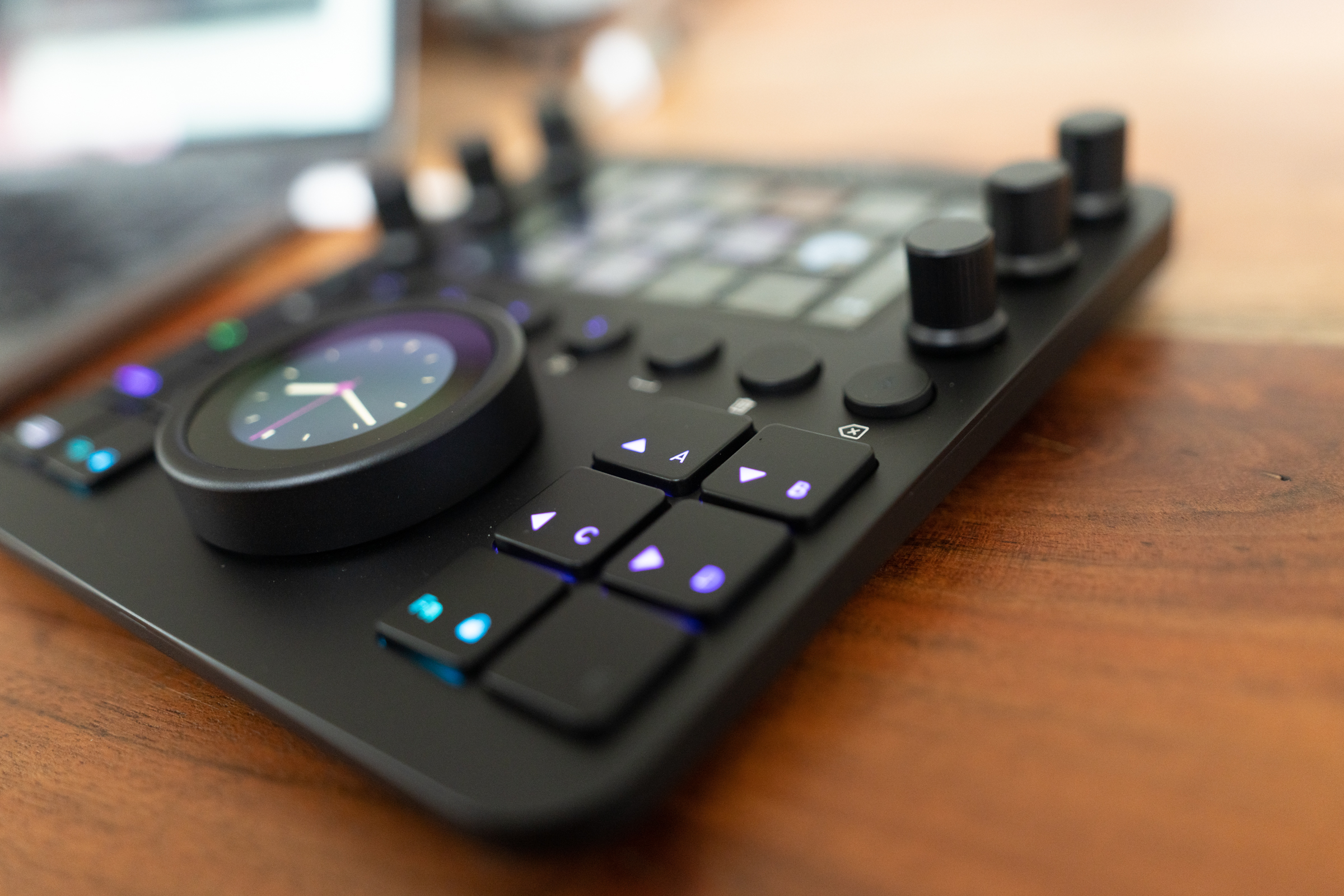
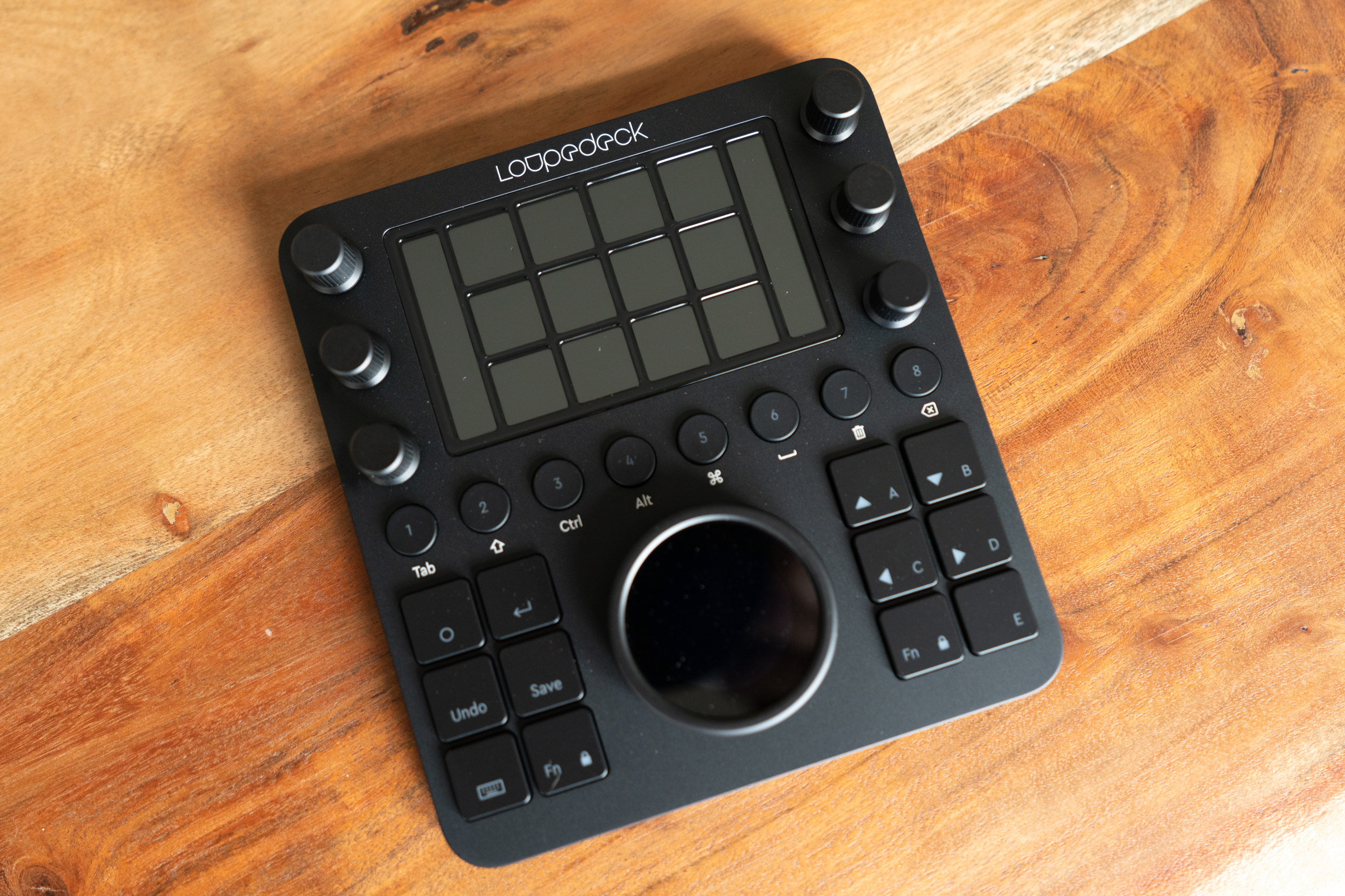
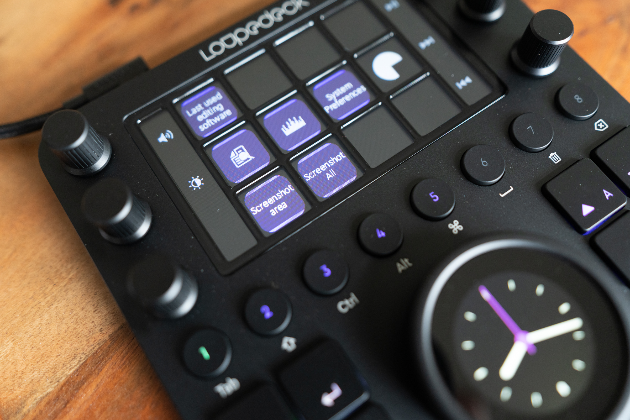
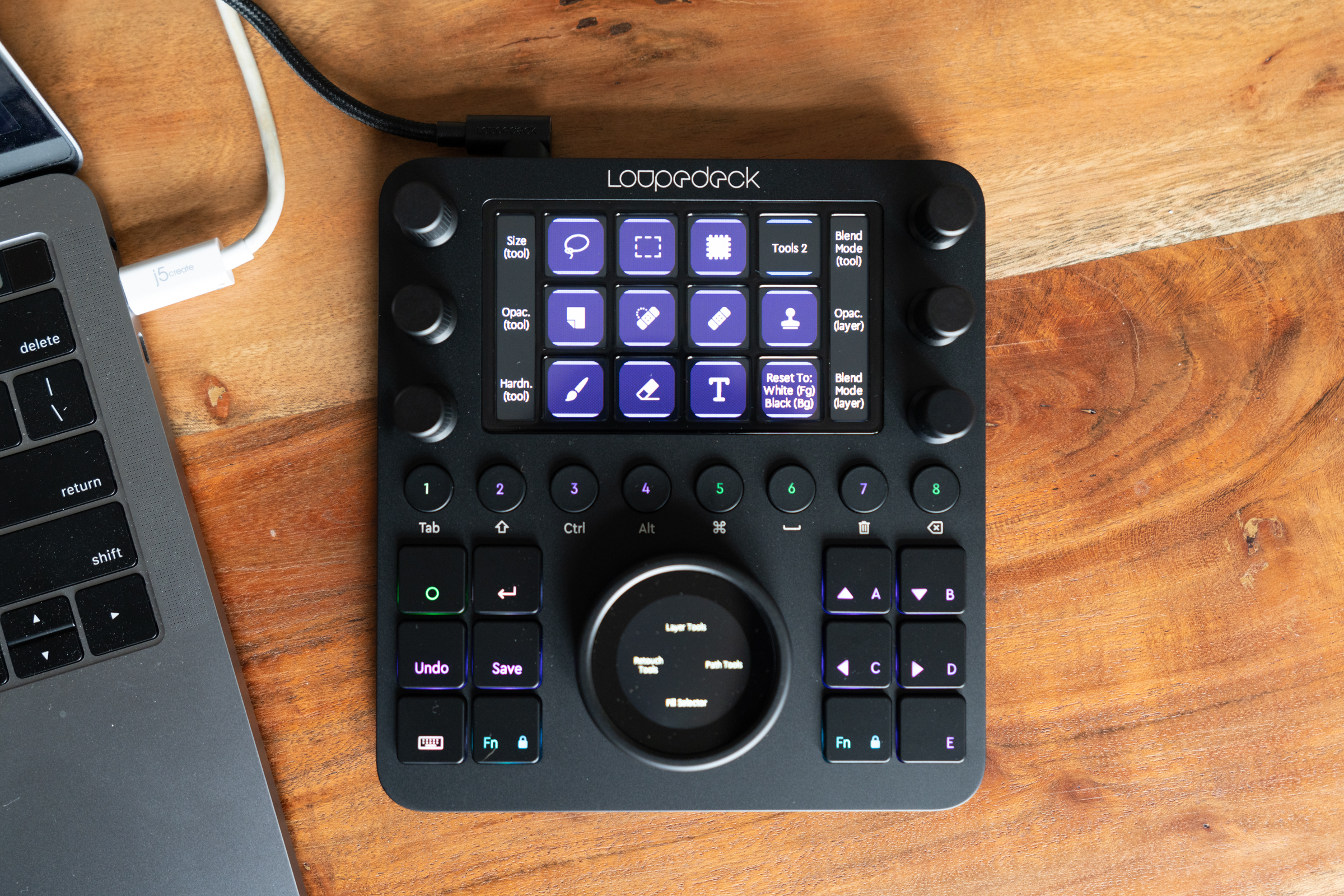
Loupedeck’s entire focus is on creating dedicated hardware control surfaces for creatives, and the Loupedeck CT is its latest, top-of-the-line editing panel. It’s essentially a square block, which is surprisingly thin and light given how many hardware control options it provides. On the surface itself, you’ll find six knobs with tactile, clicky turning action, as well as 12 square buttons and eight round buttons, each of which features color-coded backlighting. There’s also a large central control dial, with a touch-sensitive display in-set, and a 4×3 grid of touch-sensitive display buttons up top – each of which also includes optional vibration feedback when pressed.

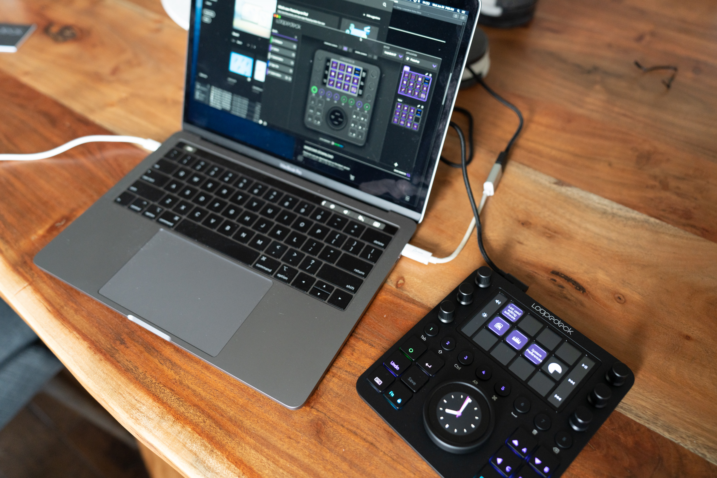
Loupedeck CT connects via an included USB-C cable (though you’ll need an adapter or your own USB-C to USB-C cable if you’re using a modern MacBook) and it draws all the power it needs to operate from that connection. Small, rubberized pads on the back ensure that it won’t slip around on your desktop or table surface.

When you first set up the Loupedeck, you’ll need to download software from the company’s website. Once that’s installed, the setup wizard should see your Loupedeck CT hardware when it’s connected, and present you with configuration options that mirror what will show up on your device. By default, Loupedeck has a number of profiles for popular editing software pre-installed and ready to use, and it’ll switch to use that profile automatically upon opening those applications.

The list is fantastic, with one notable (and somewhat painful) exception – Lightroom CC. This isn’t Loupdeck’s fault: Adobe has changed the way that Lighroom is architected with the CC version such that it no longer offers as much interoperability with plugins like the ones that make Loupedeck work with such high integration. Loupedeck offers a Lightroom Classic profile, and one of the reasons Classic is still available is its rich support for these plugins, so you can still access and edit your library with Loupedeck CT. Plus, you can still use it to control Lightroom CC – but you’ll have to download a profile that essentially replicates keystrokes and keyboard shortcuts, or create your own, and it won’t be nearly as flexible as the profiles that exist for Photoshop, Photoshop Camera Raw, and Lightroom Classic.

That one exception aside, there are profiles for just about any creative software a creative pro would want to use. And the default system software settings are also very handy for when you’re not using your computer for doing anything with image, video or audio editing. For instance, I set up basic workflows for capturing screenshots, which I do often for work, and one for managing audio playback during transcription.

Design

I mentioned it briefly above, but the Loupedeck CT’s design is at first glance very interesting because it’s actually far smaller than I was expecting based on the company’s own marketing and imagery. It’s just a little taller than your average keyboard, and about the same width across, and it takes up not much more space on your desk than a small mousepad, or a large piece of toast. Despite its small footprint, it has a lot of physical controls, each of which is actually potentially many more controls though software.

The matte black, slightly rubberized finish is pleasing both to look at and to the touch, and the controls all feel like there was a lot of care put into the tactile experience of using them. The graduated clicks on the knobs let you know when you’ve increased something by a single increment, and the smooth action on the big dial feels delightfully analog. The buttons all have a satisfying, fairly deep click, and the slight buzz you get from the vibration feedback on the touchscreen buttons are a perfect bit of haptic response, which, combined with the raised rows that separate them, mean you can use the Loupedeck CT eyes-free once you get used to it. Each knob is also a clickable button, and the touchscreen circular display on the large central dial can be custom configured with a number of different software buttons or a scroll list.

Despite its small size, the Loupedeck CT doesn’t feel fragile, and it has a nice weight to it that feels reassuring of its manufacturing quality. It does feel like a bit of a compromise when it comes to layout to accommodate the square design vs. the longer rectangle of the Loupedeck+, which more closely resembles a keyboard – but that has positives and negatives, since the CT is easier to use alongside a keyboard.

Ultimately, the design feels thoughtful and well-considered, giving you a very powerful set of physical controls for creative software that takes up much less space on the desk than even something like an equivalent modular system from Palette would require.

Features

The Loupedeck CT’s primary benefits are found in its profiles, which set you up out of the box to get editing quickly and effectively across your favorite software. Each feels like a sensible set of defaults for the software they’re designed to work with, and you can always customize and tweak to your heart’s content if you’ve already got a set of standard processes that doesn’t quite match up.

Loupedeck’s software makes customization and addition of your own sets of tools a drag-and-drop process, which helps a lot with the learning curve. It still took me a little while to figure out the logic of where to find things, and how they’re nested, but it does make sense once you experiment and pay around a bit.

Similarly, Loupedeck uses a color-coding hierarchy system in its interface that takes some getting used, but that eventually provides a handy visual shortcut for working with the Loupedeck CT. There are green buttons and lights that control overall workspaces, as well as purple actions that exist within those workspaces. You can set up multiple workspaces for each app, letting you store entire virtual toolboxes for carrying out specific tasks.

This allows the CT to be at once simple enough to not overwhelm, and also rich and complex enough to offer a satisfying range of control options for advanced pros. As mentioned, everything is customizable (minus a few buttons like the o-button that you can’t remap, for navigation reasons) and you can also export profiles for sharing or for use across machines, and import profiles, including those created by others, for quickly getting set up with a new workflow or pice of software.

The Loupedeck CT even has 8GB of built-in storage on board, and shows up as a removable disk on your computer, allowing you to easily take your profiles with you – as well a tidy little collection of working files.

Bottom Line

At $549, the Loupedeck CT isn’t for everyone – even though the features it offers provide efficiency benefits for many more than just creatives. It’s like having an editing console that you can fit in the tablet pocket of most backpacks or briefcases – and it’s actually like having a whole bunch of those at once because of the flexibility and configurability of its software. Also, comparable tools like the Blackmagic Design DaVinci Resolve Editor keyboard can cost over twice as much.

If your job or your passion involves spending considerable time adjusting gradients, curves, degrees and sliders, than the Loupedeck CT is for you. Likewise, if you spend a lot of time transcribing or cleaning up audio, or you’re a keyboard warrior who regularly employs a whole host of keystroke combos even for working in something like a spreadsheet app, it could be great for you too.

I’ve tested out a lot of hardware aimed at improving the workflow of photographers and video editors, but none has proven sticky, especially across both home and travel use. The Loupedeck CT seems like the one that will stick, based on my experience with it so far.

A new startup called Capsule has launched a new way for brands to create original video content with their community in the form of Q&As. But unlike a simple Instagram Stories’ Q&A session, Capsule provides a full platform for designing the Q&A session, branding the content, curating the responses from users and tracking the resulting data. But the most notable feature is Capsule’s automated editing process that adds branding, effects and music to the final product, allowing brands to skip the post-production process and more quickly publish their video.

The product comes from the same team behind the animated GIF capture tool and social network Phhhoto, which eventually lost out to Instagram’s clone, Boomerang. Following Phhhoto’s shutdown in late 2017, the team pivoted to an experiential marketing business, Hypno, that provided photo booths, plus other camera platforms and interactive experiences, for live events, retail and attractions.

The idea for the new startup directly emerged from the challenges now facing Hypno in the face of the COVID-19 pandemic.

“Capsule was born out of the need for some of our events and live experiences customers to figure out a way to activate their audiences because they couldn’t do it in real life,” explains co-founder Champ Bennett. “The Hypno business pretty much dried up in terms of its opportunities as soon as the pandemic hit,” he says.

The team refocused its efforts on the new software platform instead, and received an immediate, overwhelming response from its existing customers. It also quickly added new ones — including those outside the live events space.

In the two months following its MVP launch, Capsule has been generating revenue from its now 35,000 users, including some big-name customers like Netflix, Samsung, Chicago Bulls and a handful of colleges and universities that wanted to create solutions for virtual graduations. Consumers, meanwhile, have also used the product for virtual birthdays, weddings and baby showers.

The platform itself works something like a Squarespace for the video Q&A format.

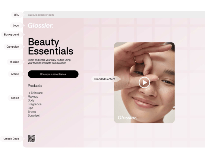
To use Capsule, the brand will first pick a template that can customize to match their current campaign by changing the logos, colors, buttons, backgrounds and URLs.

Image Credits: Capsule

They then choose their own questions and prompts designed to get their customers/users/community members talking.

To respond, users visit the Capsule URL — which can be a custom domain for an extra fee — to record and upload videos via their phone or laptop. These videos can only be a max of 60 seconds in length to keep the content short and snappy.

Brands can curate the responses they want to use in the resulting product, aka the “capsule.” They’ll also have access to the raw video footage for use elsewhere on social media, if needed.

Capsule’s best trick is that it instantly and automatically processes the video, adding music, lower-third graphics and a pre-roll and a post-roll, so the video looks professionally edited.

“It makes everybody look a little better than what they would normally look like if they were just recording right from their phone — which generally looks pretty raw and unedited,” explains Bennett. “That editing feature is the magic of that whole thing, as it makes it feel really special.”

The automated editing involves a scripting language the Capsule team created, which includes a set of instructions on how to process a given video. Capsule’s customers simply select the “type” of video they want, and Capsule does the rest.

“One might be really energetic, with flashing graphics and pumping music. And one might be a little bit more somber and may have an acoustic guitar playing behind it,” Bennett notes. “Ultimately, what will happen is when you create a Capsule, you’ll be able to pick that that feel.”

Right now, Capsule offers 10 of these “templates,” but is working to have around 50 available within the next couple of months.

Depending on the type of solution a brand needs, Capsule’s service can cost anywhere from $10 per month to as much as $20,000 per year. It currently works via the web and mobile web, but Capsule is developing an iPhone app that will allow the capture of higher-quality video.

While the original focus was to create a new engagement platform for brands that have lost the ability to host live events, the range of post-COVID use cases is continuing to grow. Netflix, for example, ran a focus group using Capsule to ask questions and get video, instead of written responses from viewers. Will Ferrell used Capsule to leave a video message for graduates. Media company OkayAfrica’s community used Capsule to talk about the impacts of the COVID-19 crisis, organized in thematic sections.

Bennett says the company is also thinking about how Capsule can be used to provide a platform for people’s voices who may not otherwise be heard.

Following its launch, it’s clear Capsule became a more flexible format than perhaps originally envisioned. But to what extent customers’ usage will change over time remains less certain. If a coronavirus vaccine is developed, for example, the need for video to stand in for live events may not be as in demand as it is now, for example. Of course, no one knows when that time will come at this point.

In addition to Bennett, Capsule’s co-founders include Russell Armand and Joseph Jorgensen, also of Phhhoto and Hypno. The company is planning to spin out Capsule from Hypno and is already receiving inbound interest from investors. Capsule has not closed a seed round at this time.

Mobile social networking app for women, Peanut, is expanding into video chat to help better support its users amid the coronavirus outbreak. The company, which began its life with a focus on motherhood, has evolved over the years to reach women looking to discuss a range of topics — including pregnancy, marriage, parenthood, and even menopause.

Since the coronavirus outbreak, Peanut reported a 30% rise in user engagement and 40% growth in content consumption. It also grew its user base from 1 million in December 2019 to 1.6 million as of April 2020. On top of this growth, Peanut closed its $12 million Series A mid-pandemic, a testament to its increasing traction.

The app had originally offered a Tinder-like matching experience to connect its users with new friends — an idea that came about thanks to founder and CEO Michelle Kennedy’s background as the former deputy CEO at dating app Badoo and an inaugural board member at Bumble. Like many dating apps, this feature involved swiping on user profiles to get a “match.” Before the pandemic, many women would connect with nearby users on a one-on-one basis in order to make friends or find playdates for their kids, for example.

But following the coronavirus government lockdowns and social distancing recommendations, Peanut users have been clamoring for a way to virtually connect, the company says.

Since the lockdown, requests from users for video chatting capabilities increased by 700%, notes Peanut. Users also posted links to other video broadcasts 400% more than usual. To meet this growing demand, the app is now rolling out video chat so women can connect face-to-face and grow their relationships, even if they’re not yet able to spend time in person.

The company believes the new feature will provide a way for women to expand their virtual support network at a time where many are facing isolation and uncertainty about the future, which could otherwise negatively impact their mental health. Through video chat, moms can arrange to have their kids participate in a virtual playdate or they can just chat about life, their daily struggles, and more. Thye can also join a virtual happy hour via their phone — a popular lockdown activity these days.

To use the new feature, women will first connect with each other on a one-on-one basis, which allows them to message each other directly. From this screen, users could already share text chats, photos, and GIFs. But now, they can tap a new button to initiate a video call instead.

The video chat feature itself is powered by an undisclosed third-party.

Peanut says it’s now working on group video chat, another feature users want.

Peanut’s video chat features officially roll out on June 18, 2020 for all users.


The Gillmor Gang — Frank Radice, Michael Markman, Keith Teare, Denis Pombriant, Brent Leary, and Steve Gillmor . Recorded live Sunday, May 31, 2020. For more, subscribe to the Gillmor Gang Newsletter.

Produced and directed by Tina Chase Gillmor @tinagillmor

@fradice, @mickeleh, @denispombriant, @kteare, @brentleary, @stevegillmor, @gillmorgang

Liner Notes

Live chat stream

The Gillmor Gang on Facebook

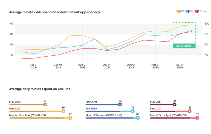
A new study on kids’ app usage and habits indicates a major threat to YouTube’s dominance, as kids now split their time between Google’s online video platform and other apps, like TikTok, Netflix, and mobile games like Roblox. Kids ages 4 to 15 now spend an average of 85 minutes per day watching YouTube videos, compared with 80 minutes per day spent on TikTok. The latter app also drove growth in kids’ social app use by 100% in 2019 and 200% in 2020, the report found.

The data in the annual report by digital safety app maker Qustodio was provided by 60,000 families with children ages 4 to 14 in the U.S., U.K., and Spain, so it’s data isn’t representative of global trends. The research encompasses children’s online habits from February 2019 to April 2020, takes into account the COVID-19 crisis, and specifically focused on four main categories of mobile applications: online video, social media, video games, and education.

YouTube, not surprisingly, remains one of the most-used apps among children, the study found.

Kids are now watching twice as many videos per day as they did just four years ago. This is despite the fact that YouTube’s flagship app is meant for ages 13 and up — an age-gate that was never truly enforced, leading to the FTC’s historic $170 million fine for the online video platform in 2019 for its noncompliance with U.S. children’s privacy regulations.

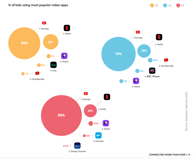
The app today is used by 69% of U.S. kids, 74% of kids in the U.K., and 88% of kids in Spain. Its app for younger children, YouTube Kids, meanwhile, is only used by 7% of kids in the U.S., 10% of kids in the U.K., and wasn’t even on the radar in Spain.

The next largest app for online video is Netflix, watched by 33% of U.S. kids, 29% of U.K. kids, and 28% of kids in Spain.

In early 2020, kids in the U.S. were spending 86 minutes on YouTube per day, down from 88 minutes in 2019. In the U.K., kids are watching 75 minutes per day, down from 77 minutes in 2019. And in Spain, kids watch 63 minutes per day, down from 66 minutes in 2019.

During the COVID-19 lockdowns, the time spent increased quite a bit, as you could imagine. In the U.S., for example, kids in mid-April spent 99 minutes per day on YouTube.

In part, the decline in total YouTube minutes could be due to the growing number of daily minutes kids spend on TikTok. The Beijing-owned short-form video app could gain further traction if more YouTube creators leave Google’s video platform as a result of the increasing regulations and the related losses in monetization. More creators would broaden TikTok’s appeal, as it expands its content lineup.

Last year, TikTok became one of the top five most-downloaded apps globally that wasn’t owned by Facebook, and it has continued to grow among all age demographics.

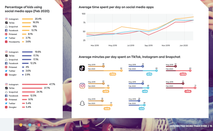
From May 2019 through February 2020, the average minutes per day kids spent on TikTok increased by 116% in the U.S. to reach 82 minutes, went up by 97% in the U.K. to reach 69 minutes, and increased 150% in Spain to reach 60 minutes.

In February 2020, 16.5% of U.S. kids used TikTok, just behind the 20.4% on Instagram, and ahead of the 16% on Snapchat. In the U.K. and Spain, 17.7% and 37.7% of kids used TikTok, respectively.

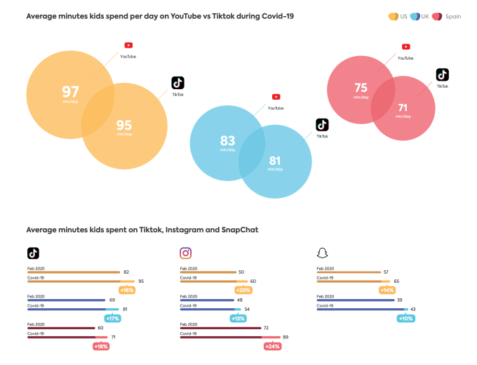
Time spent on TikTok increased during COVID-19 lockdowns, as well, leaving the app now only minutes away from being equal to time spent on YouTube. In the U.S., for example, kids’ average usage of TikTok hit 95 minutes per day during COVID-19 lockdowns compared with just 2 minutes more — 97 minutes — spent on YouTube

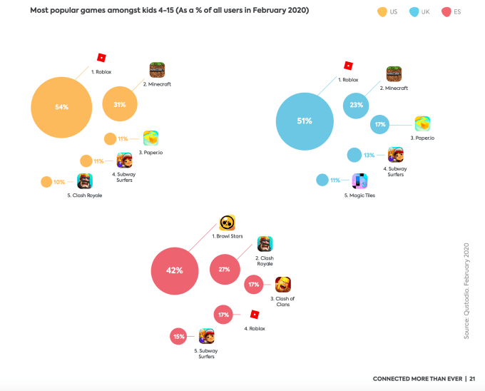
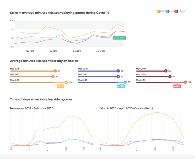
In terms of online gaming, Roblox dominates in the U.S. and U.K., where 54% and 51% of kids play, respectively. In Spain, only 17% do. Instead, kids in Spain currently prefer Brawl Stars.

Similarly, Minecraft is used by 31% of kids in the U.S., 23% in the U.K., and only 15% in Spain.

Roblox isn’t just a minor diversion. It’s also eating into kids’ screen time.

In February 2020, this one game accounted for 81 minutes per day, on average, in the U.S., 76 minutes per day in the U.K., and 64 minutes per day in Spain. On average, kids play Roblox about 20 minutes longer than any other video game app. (Take that, Fortnite!)

During COVID-19 lockdowns, the kids who played Roblox increased their time spent in the game, up 31%, 17%, and 45% respectively in the U.S., the U.K., and Spain. But lockdowns didn’t increase the percentage of kids who used gaming apps, as it turned out.

Education apps, as a whole, did not see much growth from 2019 to early 2020 until the COVID-19 lockdowns. But then, Google Classroom won in two of the three markets studied, with 65% of kids now using this app in Spain, 50% in the U.S., but only 31% in the U.K. (Show My Homework is more popular in the U.K., growing to 42% usage during COVID-19.)

All these increases in kids’ app usage may never return to pre-COVID-19 levels, the report suggested, even if usage declines a bit as government lockdowns lift. That mirrors the findings that Nielsen released today on connected TV usage, which has also not yet fallen to earlier, pre-COVID levels even as government restrictions lift.

“We now live in a world with an estimated 25 billion connected devices worldwide. Many of those in the hands of children,” Qustodio’s report noted. “Today, on average, a child in the U.S. watches nearly 100 minutes of YouTube per day, a child in the U.K. spends nearly 70 minutes on TikTok per day, a child in Spain plays Roblox over 90 minutes a day,” it said. “The world is not going to return to the way things were, because screen-time rates were already increasing. COVID-19 just accelerated the process,” the firm concluded.

Mobile safety app Parachute is today rolling out a new feature that will prevent an unauthorized person who grabs your iPhone to stop it from recording live video, even if they attempt to turn off the phone entirely. The timely update arrives amid the nationwide George Floyd protests against police brutality and the systemic racism present in the American justice system.

Bystander video of Floyd’s death triggered the demonstrations and protests, and video has continued to serve as key documentation of those events.

The Parchute app, which first launched at TechCrunch Disrupt 2015 as “Witness,” has long described itself as a panic button for the smartphone age. The app is intended to alert your emergency contacts when you’re in trouble — by simultaneously calling, texting, and emailing and by sending them your live video, audio, and location straight from your current location.

The app also has an option that allows users to record discreetly by blacking out the screen so it doesn’t show that live video is being recorded. Plus, Parachute records simultaneously from both cameras to increase the chance of getting the incident on film. The video is pushed out from the phone to Parachute’s platform and the evidence of the video is erased from the phone. In addition to the link sent to your emergency contacts, users can also later download the video from the link they’re emailed directly.

Despite its unique functionality, the app has gained only a small following in the years since its launch. According to data from app intelligence firm Sensor Tower, Parachute has not topped 100,000 downloads on the U.S. App Store. It also doesn’t currently rank on the App Store’s charts.

Parachute declined to provide user numbers, but noted its app has seen higher activity this past week in the U.S. and in Hong Kong.

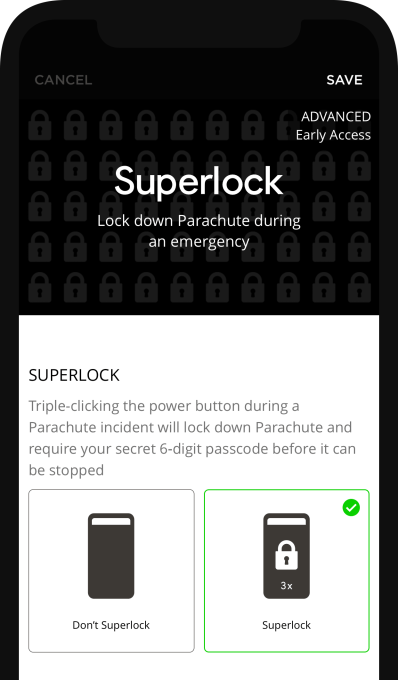
Its new feature, known as SuperLock, is an attempt to regain interest in Parachute’s video recording feature set.

SuperLock works in tandem with Apple’s Guided Access to lock down the user’s phone. Parachute explains how to set up Guided Access via an in-app tutorial. The process involves heading to the iPhone’s Settings area, then going to the Guided Access section under Accessibility and toggling the switch so it’s on.

Afterward, you return to the app and triple-click the power button and tap on the “Start” button at the top right of the screen to select a 6-digit passcode. This is the passcode that will have to be entered to stop Parachute from recording video in the future. You then triple-click the iPhone power button again, enter the passcode you just created again, and tap the “End” button on the top left.

When setup is complete, you can put Parachute in Superlock mode at any time by triple-clicking the power button.

The app will keep recording the video and lock down your iPhone until the power button is triple-clicked and the passcode is re-entered.

This process cuts off access to the “X” button that typically displays to end a recording incident in the app. It also prevents anyone else who gains possession of your phone from shutting off the video themselves.

The company explains that even if your phone runs out of battery, crashes, or experiences a hard reboot, the SuperLock feature can be configured to resume recording upon reboot. And SuperLock can work with the feature that disables the video preview, so no one knows your phone is recording.

Parachute can also run in the background as you switch and use other apps, the company adds.

In the case that the unauthorized user tries to guess your passcode, an increasing time-delay mechanism will prevent them from trying too many combinations quickly — similar to how the iPhone stops people from having the chance to quickly try different passcodes.

The company’s business model allows for the storage of incidents that expire 3 months after being created. A full membership is $9.99/month for unlimited devices, contacts, alerts, incidents, and storage. An affordable $2.99 per year “Lite” membership is also available. Parachute has not taken VC funding.

The update is live today on iPhone.

In this instalment of our ongoing series around making the most of your at-home video setup, we’re going to focus on one of the most important, but least well understood or implemented parts of the equation: Lighting. While it isn’t actually something that requires a lot of training, expertise or even equipment to get right, it’s probably the number one culprit for subpar video quality on most conference calls – and it can mean the difference between looking like someone who knows what they talk about, and someone who might not inspire too much confidence on seminars, speaking gigs and remote broadcast appearances.

Basics

You can make a very big improvement in your lighting with just a little work, and without spending any money. The secret is all in being aware of your surroundings and optimizing your camera placement relative to any light sources that might be present. Consider not only any ceiling lights or lamps in your room, but also natural light sources like windows.

Ideally, you should position yourself so that the source of brightest light is positioned behind your camera (and above it, if possible). You should also make sure that there aren’t any strong competing light sources behind you that might blow out the image. If you have a large window and it’s daytime, face the window with your back to a wall, for instance. And if you have a moveable light or a overhead lamp, either move it so it’s behind and above your computer facing you, or move yourself if possible to achieve the same effect with a fixed position light fixture, like a ceiling pendant.
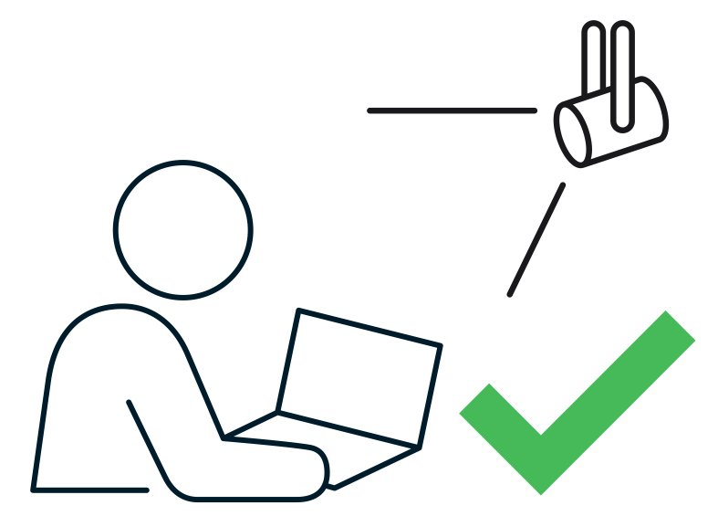
Ideally, any bright light source should be positioned behind and slightly above your camera for best results.

Even if the light seems aggressively bright to you, it should make for an even, clear image on your webcam. Even though most webcams have auto-balancing software features that attempt to produce the best results regardless of lighting, they can only do so much, and especially lower-end camera hardware like the webcam built into MacBooks will benefit greatly from some physical lighting position optimization.
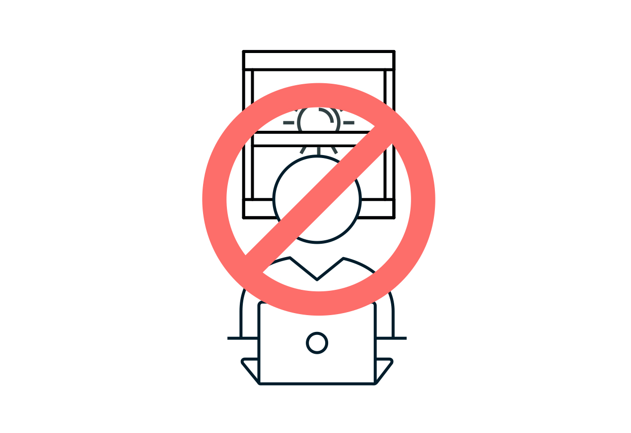
This is an example of what not to do: Having a bright light source behind you will make your face hard to see, and the background blown out.

Simple ways to level-up

The best way to step up beyond the basics is to learn some of the fundamentals of good video lighting. Again, this doesn’t necessarily require any purchases – it could be as simple as taking what you already have and using it in creative ways.

Beyond just the above advice about putting your strongest light source behind your camera pointed towards your face, you can get a little more sophisticated by adopting the principles of two- and three-point lighting. You don’t need special lights to make this work – you just need to use what you have available and place them for optimal effect.

  • Two-point lighting

A very basic, but effective video lighting setup involves positioning not just one, but two lights pointed towards your face behind, or parallel with your camera. Instead of putting them directly in line with your face, however, for maximum effect you can place them to either side, and angle them in towards you.
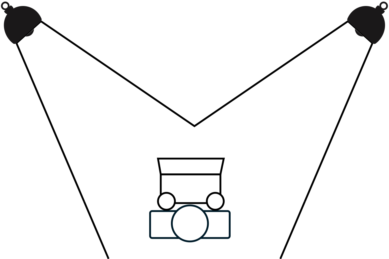
A simple representation of how to position lights for a proper two-point video lighting setup.

Note that if you can, it’s best to make one of these two lights brighter than the other. This will provide a subtle bit of shadow and depth to the lighting on your face, resulting in a more pleasing and professional look. As mentioned, it doesn’t really matter what kind of light you use, but it’s best to try to make sure that both are the same temperature (for ordinary household bulbs, how ‘soft,’ ‘bright’ or ‘warm’ they are) and if your lights are less powerful, try to position them closer in.

  • Three-point lighting

Similar to two-point lighting, but with a third light added positioned somewhere behind you. This extra light is used in broadcast interview lighting setups to provide a slight halo effect on the subject, which further helps separate you from the background, and provides a bit more depth and professional look. Ideally, you’d place this out of frame of your camera (you don’t want a big, bright light shining right into the lens) and off to the side, as indicated in the diagram below.
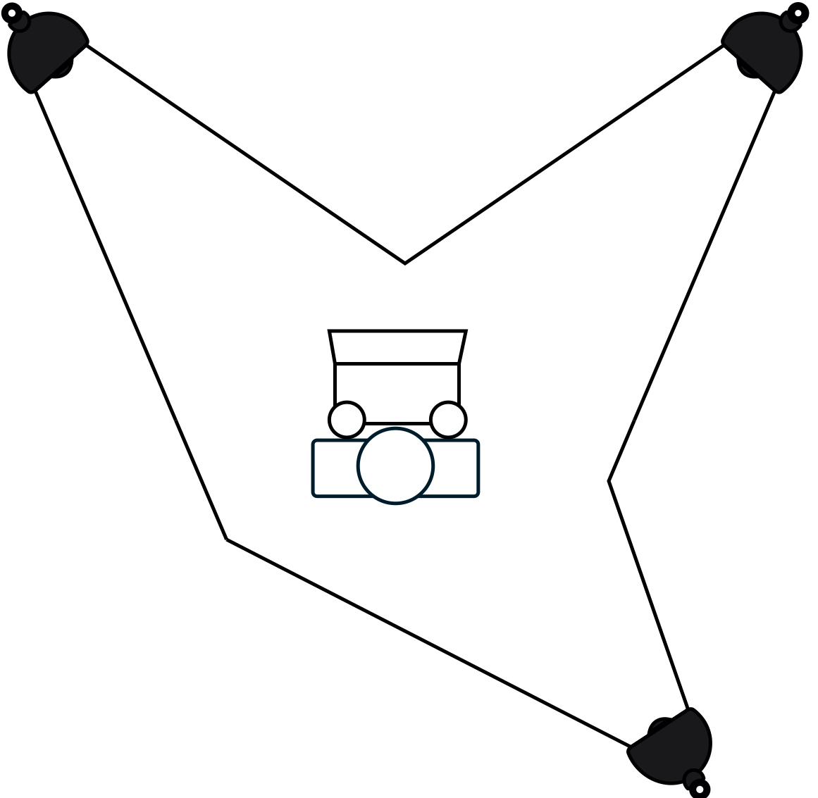
In a three-point lighting setup, you add a third light behind you to provide a bit more subject separation and pop.

If you’re looking to improve the flexibility of this kind of setup, a simple way to do that is by using light sources with Philips Hue bulbs. They can let you tune the temperature and brightness of your lights, together or individually, to get the most out of this kind of arrangement. Modern Hue bulbs might produce some weird flickering effects on your video depending on what framerate you’re using, but if you output your video at 30fps, that should address any problems there.

Go pro

All lights can be used to improve your video lighting setup, but dedicated video lights will provide the best results. If you really plan on doing a bunch of video calls, virtual talks and streaming, you should consider investing in some purpose-built hardware to get even better results.

At the entry level, there are plenty of offerings on Amazon that work well and offer good value for money, including full lighting kits like this one from Neewer that offers everything you need for a two-point lighting setup in one package. These might seem intimidating if you’re new to lighting, but they’re extremely easy to set up, and really only require that you learn a bit about light temperature (as measured in kelvins) and how that affects the image output on your video capture device.
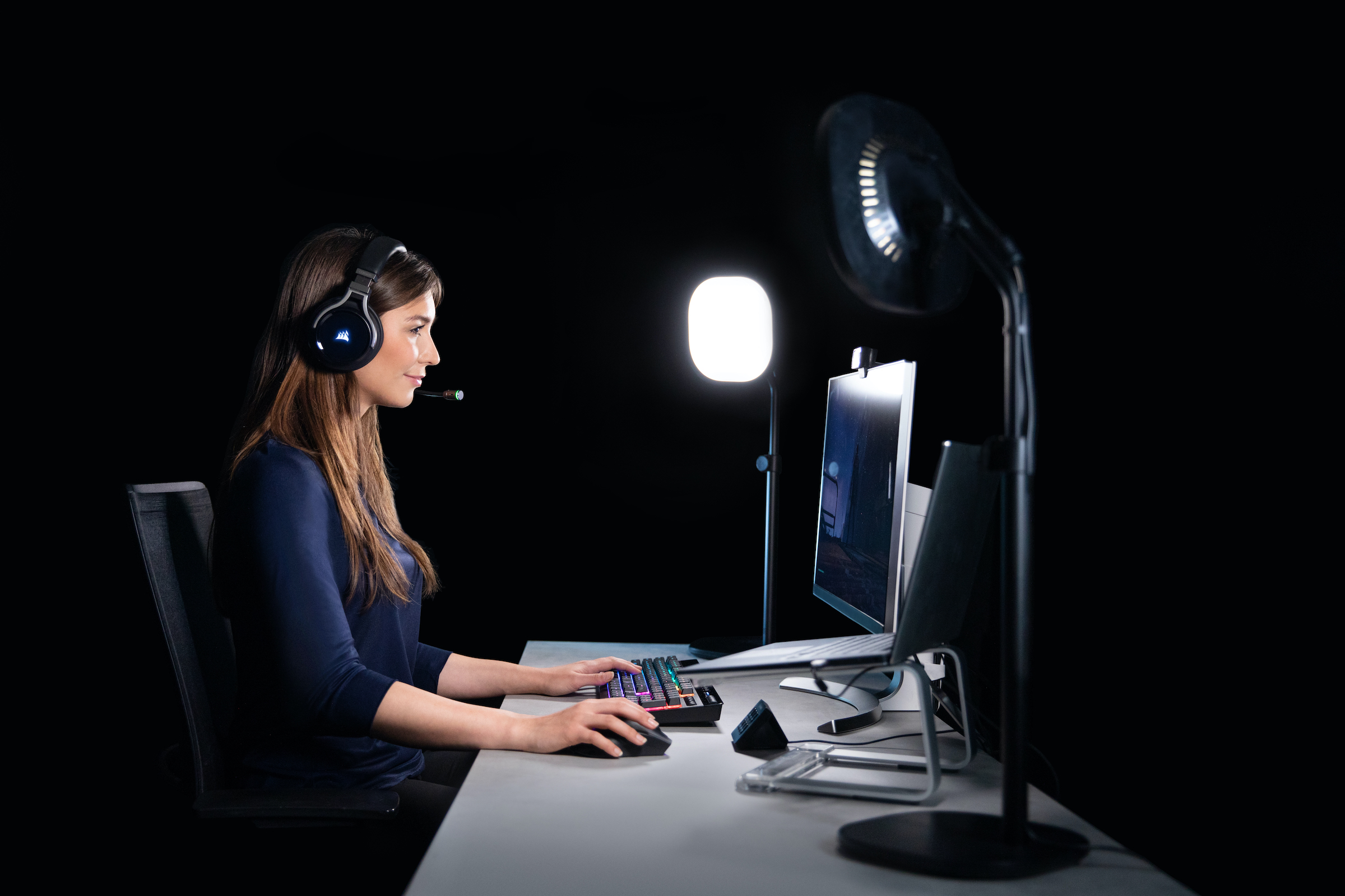
If you’re willing to invest a bit more money, you can get some better quality lights that include additional features including wifi connectivity and remote control. The best all-around video lights for home studio use that I’ve found are Elgato’s Key Lights . These come in two variants, Key Light and Key Light Air, which retail for $199.99 and $129.99 respectively. The Key Light is larger, offers brighter maximum output, and comes with a sturdier, heavy-duty clamp mount for attaching to tables and desks. The Key Light Air is smaller, more portable, puts out less light at max settings and comes with a tabletop stand with a weighted base.

Both versions of the Key Light offer light that you can tune form very warm white (2900K) to bright white (7000K) and connect to your wifi network for remote control, either from your computer or your mobile device. They easily work together with Elgato’s Stream Deck for hardware controls, too, and have highly adjustable brightness and plenty of mounting options – especially with extra accessories like the Multi-Mount extension kit.
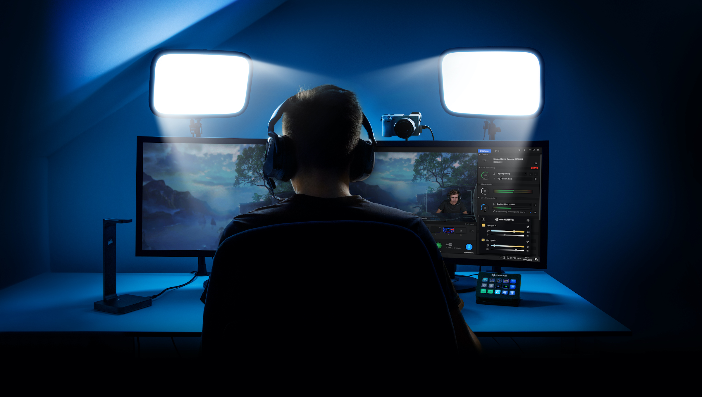
With plenty of standard tripod mounts on each Key Light, high-quality durable construction and connected control features, these lights are the easiest to make work in whatever space you have available. The quality of the light they put out is also excellent, and they’re great for lighting pros and newbies alike since it’s very easy to tune them as needed to produce the effect you want.

Accent your space

Beyond subject lighting, you can look at different kinds of accent lighting to make your overall home studio more visually interesting or appealing. Again, there are a number of options here, but if you’re looking for something that also complements your home furnishings and won’t make your house look too much like a studio set, check out some of the more advanced versions of Hue’s connected lighting system.
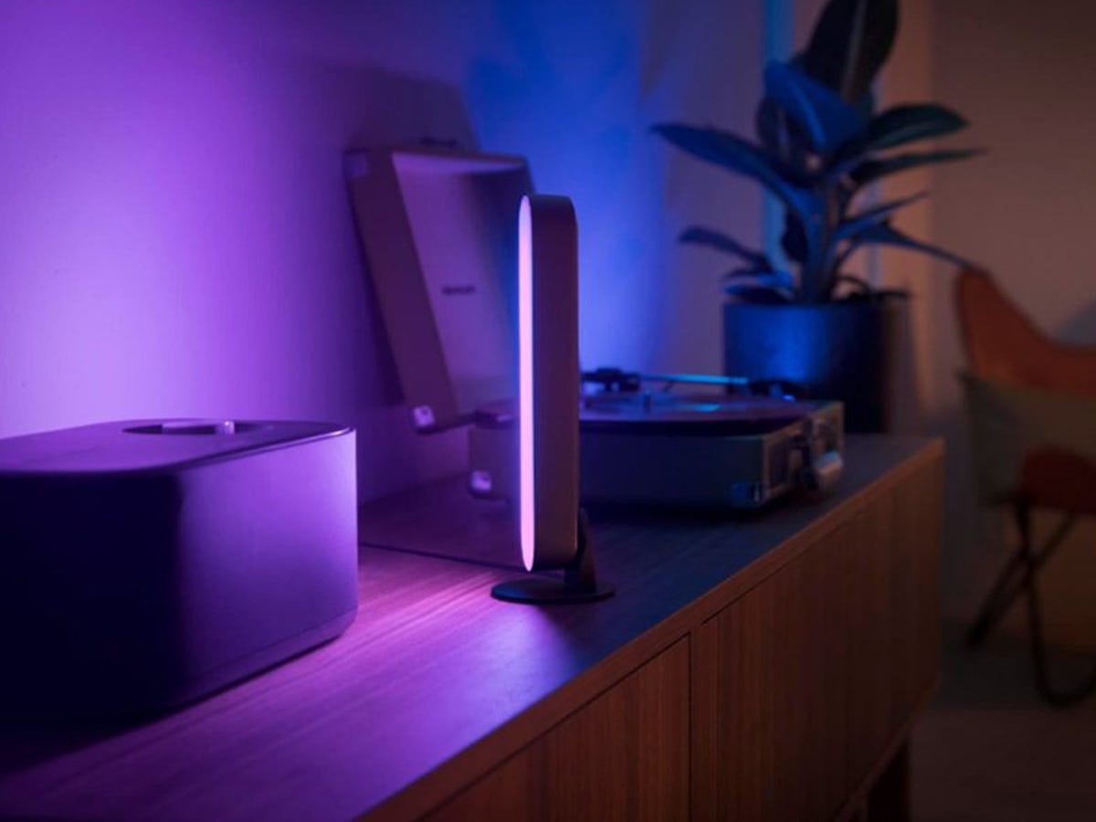
The Hue Play light bar is a great accent light, for instance. You can pick up a two pack, which includes two of the full-color connected RGB lights. You’ll need a Hue hub for these to work, but you can also get a starter pack that includes two lights and the hub if you don’t have one yet. I like these because you can easily hide them behind cushions, chairs, or other furniture. They provide awesome uplight effects on light-colored walls, especially if you get rid of other ambient light (beyond your main video lights).
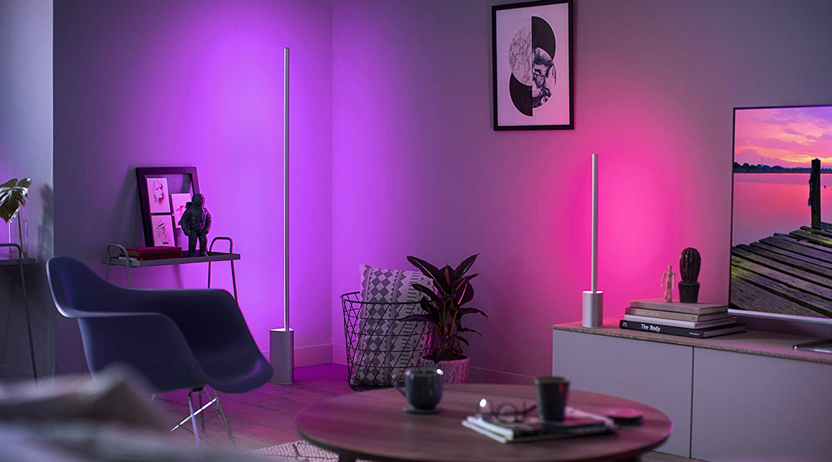
To really amplify the effect, consider pairing these up with something one the Philips Hue Signe floor or table lamps. The Signe series is a long LED light mounted to a weighted base that provide strong, even accent light with any color you choose. You can sync these with other Hue lights for a consistent look, or mix and max colors for different dynamic effects.

On video, this helps with subject/background separation, and just looks a lot more polished than a standard background, especially when paired with defocused effects when you’re using better quality cameras. As a side benefit, these lights can be synced to movie and video playback for when you’re consuming video, instead of producing it, for really cool home theater effects.

If you’re satisfied with your lighting setup but are still looking for other pointers, check out our original guide, as well as our deep dive on microphones for better audio quality.
If you’ve ever found yourself scrubbing your way through a long YouTube video to get to the “good” part, you’ll appreciate the new feature YouTube is launching today: Video Chapters. The feature uses timestamps that creators apply to their videos, allowing viewers to easily jump forward to a specific section of the video or rewatch a portion of the video.

YouTube was spotted testing Video Chapters back in April, but today the feature is going live for all users across iOS, Android, and desktop.

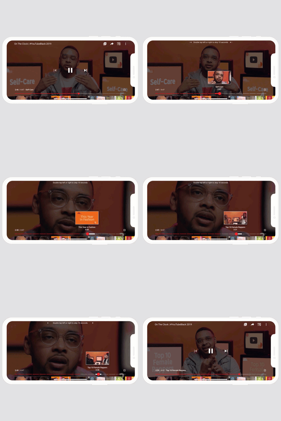
Video Chapters will be automatically enabled when creators add chapter information to their video’s description as a line of timestamps and titles. The first timestamp has to be marked 0:00, followed by a space, then the chapter’s title. On the next line, you’ll type the timestamp where the next chapter starts (e.g. “2:31”), then a space and that chapter’s title. When you’re finished adding in the chapters, you save the changes and the Video Chapters will be listed as you scrub through the video.

Videos will need to have at least 3 timestamps that are 10 seconds or more in length in order to use the feature.

To make it easier for viewers to navigate Video Chapters, YouTube built in haptic feedback on mobile so users will feel a slight “thump” that informs them they’re moving into a new chapter, the company explains. On platforms where haptic feedback is not available, YouTube instead uses a “snapping” behavior that will snap you to the start of the chapter. That way, viewers who want to land on a precise spot near the chapter start can wait for a moment before releasing so they aren’t snapped to the start of the chapter.

In addition, users on mobile and tablet devices can also slide their finger up and down while scrubbing — without releasing — to reveal the scrubber bar and see exactly where they’re placing the playhead.

YouTube said the feature gained a lot of positive feedback during testing, but it has tweaked the product a bit based on its earlier experimentation.

For example, YouTube has since increased the number of supported chapters across devices after realizing that it was helpful to allow the devices to determine how many chapters can be shown, based on the available screen space. That means in a video with a lot of chapters, you may see more on desktop than on mobile devices, and more appear when you’re full screen on your phone than when you’re viewing the video in the smaller, portrait player.

Because the feature requires the creator to input the timestamps, you may not see it on all videos just yet. But there are a few you can visit now if you want to see Video Chapters in action, including this Flaming Lips concert, this Radiohead concert, this Spotlight channel interview with creators, this guitar tutorial, this cooking video, this recipe video, and this lecture on machine learning.

The new feature positions YouTube to be a better resource for long-form content as it becomes less cumbersome to navigate videos. The feature could even increase user engagement with some videos as viewers won’t get frustrated by having to scroll through parts they don’t want to watch, give up, then exit the video in search of a different one that’s easier to navigate. On the flip side, it could decrease total watch times, as viewers only watch particular sections of videos instead of the video’s full content.

YouTube says the new feature will not impact recommendations.